Cooking the books, ONS style (Part II)
Creating the illusion of vaccine effectiveness by fiddling the death numbers.
In Part I, I showed some obvious discrepancies in the vaccination-status populations used by the ONS in their analysis of COVID “vaccine effectiveness”.
In Part II, I continue my forensic analysis and reveal that these discrepancies are also apparent in the death numbers.
Let’s start by looking at the impact on the mortality rate by using the “true” vaccinated population as implied by the unadulterated NIMS dataset. Fortunately, the adjustment does not materially affect the age-standardised mortality rate (ASMR) of the vaccinated 70 to 79 year olds in England.
However, there is apparently a much more significant anomaly. Deriving the expected ASMR from the deaths and population numbers from May, we observe they are steady around a mean of 38.2 deaths per 100,000 population. Nothing unusual in that. But the vaccinated population non-COVID ASMR starts substantially lower in January (around 20.0) and gradually increases to this steady rate.
In absolute terms, non-COVID deaths are constant throughout the entire period. So, if the vaccinated status of the deaths were correct, it would imply that the vaccinated appear to have some sort of health benefit immediately after dose 1 that confers them some protection against a mysterious non-COVID mortality event but gradually wanes and finally disappears after dose 2.
OK, if you believe that, you’re probably not reading this anyway!
Really, as we suspected after analysing the population data, it seems likely there is some fishiness in the death data too. Well, let’s correct that and see what difference it makes, shall we?
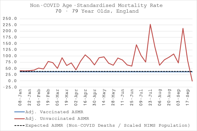
First, let’s put the unvaccinated on there too.
Inevitably, given flat non-COVID deaths for both vaccinated states, the unusual deficiency in the vaccinated has to be made up by a surplus in the unvaccinated. In case you are still with me despite your cognitive dissonance, believing in the dose 1 miracle non-COVID cure, this implies that there was another mortality shock starting after vaccinations that only affected the unvaccinated. If you are still here, I have a bridge to sell you…
My hypothesis is that the rate of accumulation of non-COVID deaths in the vaccinated should simply follow the rate of vaccination. It is plausible that the rate should outpace the vaccination rate due to the potential of fatal side effects but I’m going to be conservative and assume that doesn’t happen (much like public health bodies and mainstream media).
Evidently, the mortality rate is not following the vaccination rate. Oh, dear.
Not to worry though, we can fix it so that it does by simply using the vaccination rate to infer the expected non-COVID deaths.
There we go. Now, if we plot those missing weekly non-COVID vaccinated deaths against weekly vaccinations, we can see a very clear pattern indeed. The missing deaths follow vaccinations with around about 1 week lag on average. Interesting.
In total, there are around 4,200 missing deaths but only 1,500 appear to be put back after June. Even more interesting. Not interesting enough for me to speculate why this might be though, just that it appears to have happened for one reason or another…
So, what happens then if we apply this “correction” to the data and take another look at the ASMRs?
Well, it looks slightly more reasonable. But now we have introduced another anomaly. Instead of “something” (not COVID) causing the unvaccinated to die (but not the vaccinated) occurring at the start of the observation period, we have simply introduced it to the end. Well, that can’t be right either. Let’s try something else. Instead of assuming that the vaccinated mortality rate ought to be at least equal to the long term steady state, we really should have adjusted the unvaccinated to that level since they are really the ones who should be showing no deviation from the expectation.
Ah ha, now we’re getting somewhere that makes logical sense! It would seem that the vaccinated non-COVID mortality rate shoots up after dose 1. This would fit with the plausible expectation that the most vulnerable were injected first (they were already moribund) and potentially indicates the fatal side effects of the vaccine that we did try to ignore. It seems, you just can’t avoid these things when you analyse the data properly, eh?
If we look closer at the data after the initial shock, we can make a better judgement. Since mid-Feb, the vaccinated have a persistant, higher non-COVID mortality rate than the unvaccinated, around 6% on average. This seems more likely to be evidence of fatal side effects.
But what of our correction now? Is it still plausible? In fact, yes, even more so!
We now have an almost round 6,500 deaths “missing” from the vaccinated that when moved over from the unvaccinated make the non-COVID mortality look just as you would logically expect. Well, fancy that. And the distribution of those deaths mirrors the vaccination schedule.
Next up, in Part III, we’ll take a forensic look at COVID mortality.


Brilliant💕
These non-Covid deaths were misclassified because they'd had one jab at time of death or two jabs but less than 14 days at time of death? Is that correct?