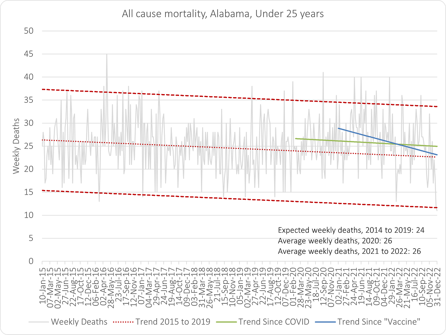
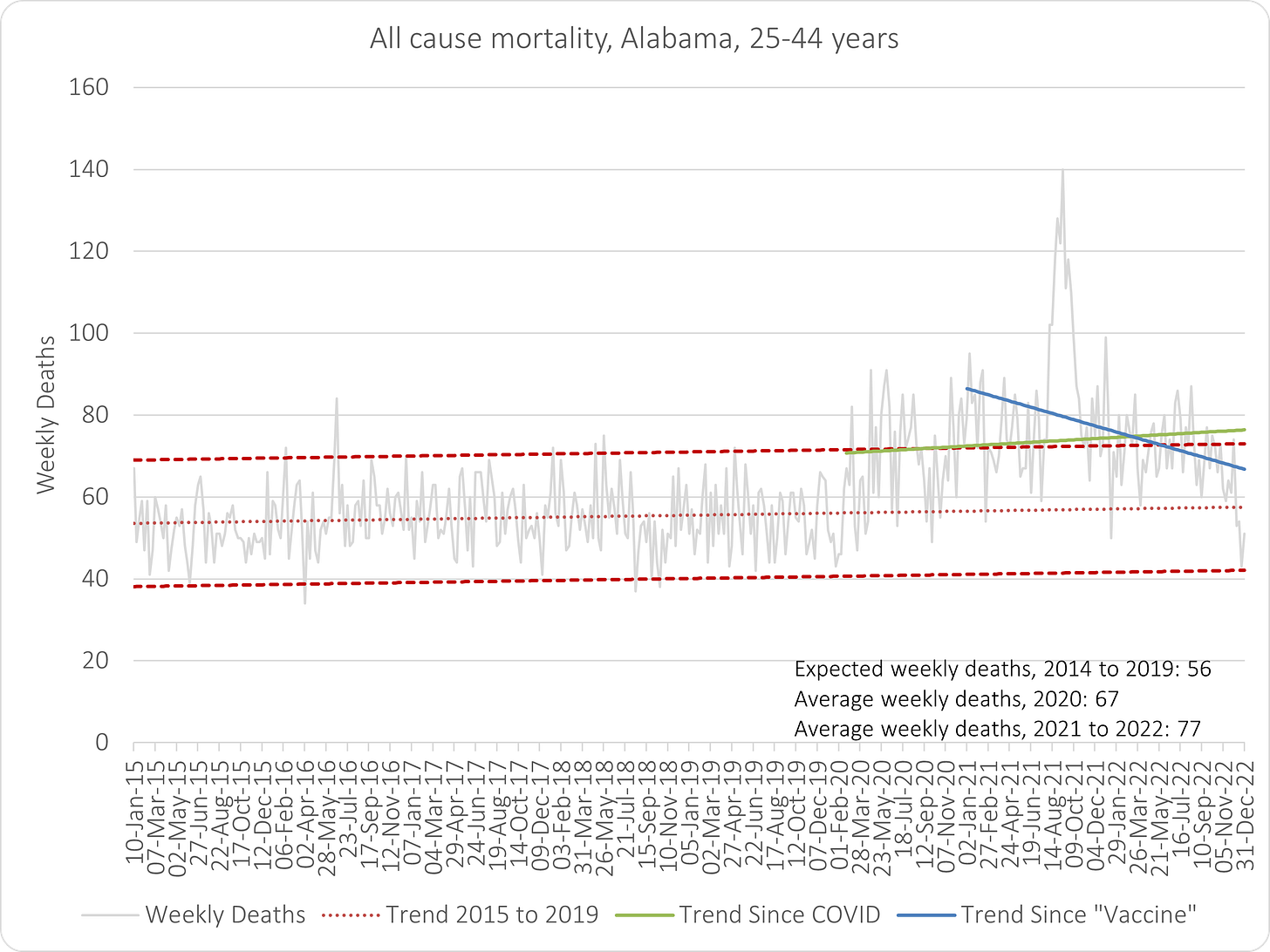
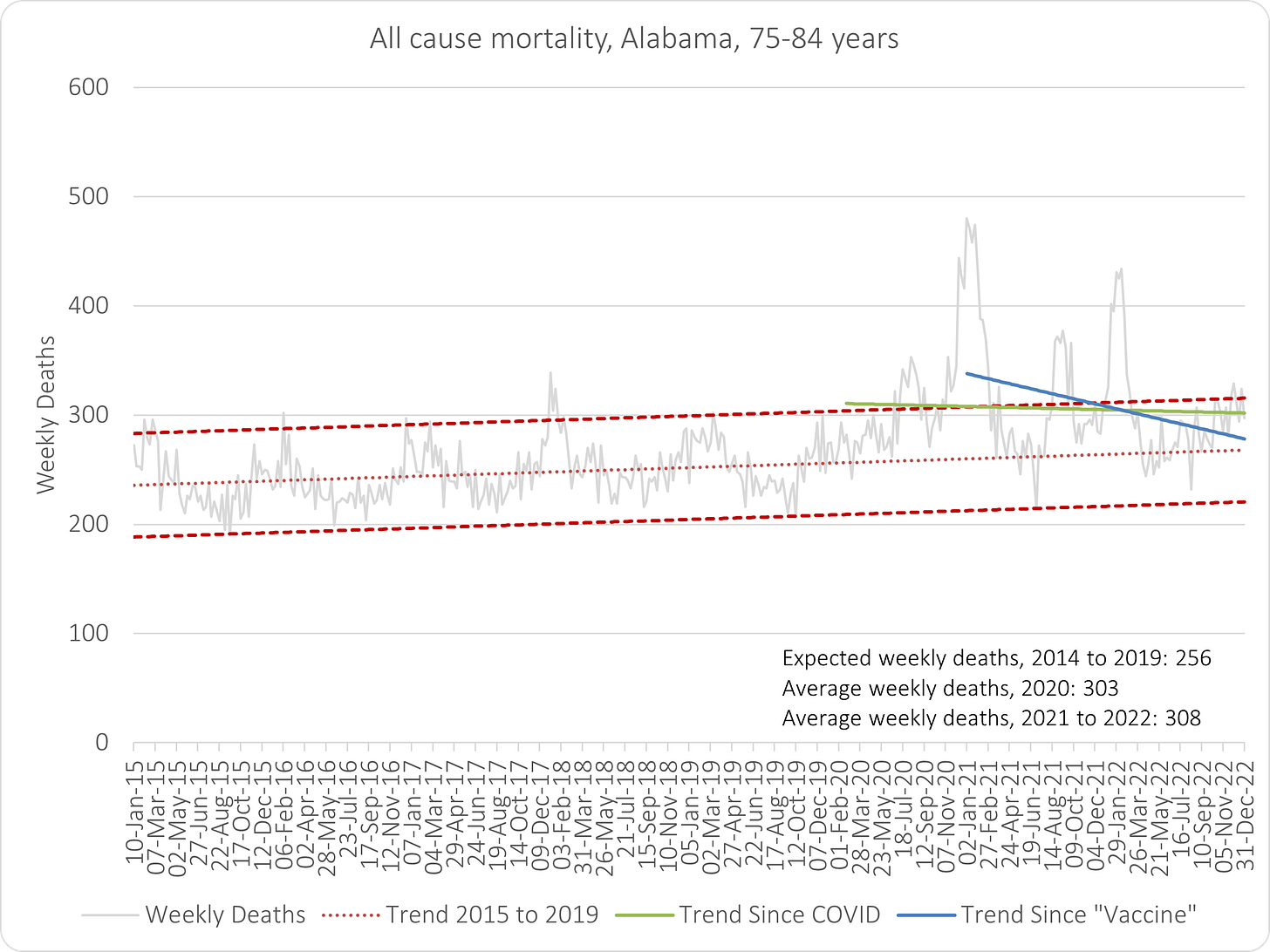
All-Cause Mortality, Alabama, 2015 to 2022
Where is the evidence that COVID "vaccines" were necessary, safe and effective?
Introduction
Steve Kirsch asked me to reproduce my Scotland analysis using US state data to show I didn’t cherry pick a country. My first retort, as always - it isn’t for me to prove anything. Those who impose this global, medical experiment are obliged to show that it is necessary, safe and effective in every country.
If I can refute this in even one country, that’s their problem, not mine. The fact that I can demonstrate it in pretty much every country that “vaccinated” shows it’s a really big problem for them. Hence why they revert to dogma and propaganda. They can fool the majority with that but only for so long.
Nevertheless, here’s the first US state in the alphabet - Alabama.
My other comments to Steve went along these lines:
My goal here is to reinforce the point that those who impose such an intervention on the population have to have substantial evidence on their side to support their actions. And ultimately, it should be the people who determine this, not the autocrats.
I think it's a great exercise to promote the true function of judge and jury. My role here (as “judge”) is to provide expert guidance on the data and analysis but ultimately, it's up to the reader (as “jury”) to interpret the information according to their own conscience and judge accordingly.
I’ll keep the rest of the introduction and abridged guidance so you don’t have to open the other link but note that it is much improved since my first draft due to the enormous amount of feedback I received and used to improve myself as judge guide.
The three most important questions regarding COVID “vaccines”:
Are they necessary?
Are they safe?
Are they effective?
We can answer all these questions simply by looking at all-cause mortality trends across three periods:
Five years prior to COVID (2015 to 2019).
Three years since COVID (2020 to 2022).
Two years since COVID “vaccines” (2021 to 2022).
Guidance
For the “vaccine” to be necessary, there must be a discernible increase in mortality during 2020, over and above what might be expected given the prevailing trend. Nevertheless, one must also take into account that trends do not continue forever so reservation must be made for potential reversal of trend. If nothing else, this should simply give us reason to contemplate greater uncertainty in our judgement. The safety and efficacy of a vaccine has no bearing on its necessity.
For the “vaccine” to be considered safe, at worst, there must be no more mortality in 2021 and 2022 than 2020 and the trend should be no steeper than 2020. This should be the case for all ages.
For the “vaccine” to be considered effective, there should be discernibly less mortality in 2021 and 2022 than 2020 and the trend should preferably be no steeper than 2014 to 2019. Inevitably, the 2021 to 2022 trend should be substantially shallower than the trend for 2020 to 2022 (or decline more steeply if both trends are already downward sloping).
Note that a downward sloping trend could be due to higher than expected deaths earlier in the period, followed by lower than expected deaths and is not, therefore, necessarily an indication of effectiveness in reducing mortality. This is to be expected since lower mortality often follows periods of excess due to the “pull forward” effect. If this is evident in this latter 3-year observation period, it would be indicative of people dying only one or two years sooner than they probably would have done in the absence of some unexpected mortality event.
It is important to look whether the COVID and vaccine trends start higher than the 5-year trend to 2019, especially if they remain above the earlier trend for any length of time in spite of sloping downwards. This is also the case for the post-“vaccine” trend relative to the the COVID trend.
The average weekly deaths for each period will also give a clear indication whether mortality is elevated or not and to what extent.
Also consider that mortality data is incomplete due to delays in registration. This will be most impactful on most recent data which will result in it being lower than it really is. In other words, although the average weekly deaths for all three periods can only rise, the 2021-2022 average is more likely to rise than the other two periods.
Overall, when judging an intervention such as the mass injection of an entire population with a novel therapy, the obligation for certainty should be in favour of the intervention. This means that the evidence should be consistently beneficial to find in favour of it being safe and effective. Anything less then it would be prudent to judge against it.
Data
I truly believe the people of the world should self-determine and not be subject to any whim of government. So, let’s see how a jury might judge if this was a case in court deciding on whether their own tax money should be spent on this intervention?
Based only on the mortality evidence presented and not on any prior assumptions or third-party direction, and beyond reasonable doubt:
Now, please be honest!


I'm spoiled. I work in an industrial laboratory and can demand more information about the data and how it was collected. Your pretty colored lines for slope indicate a decrease in deaths since the vaccine. But they are at the end of the very noisy data. As a member of the jury I would like to see the data with no slopes and only two vertical lines. Start of Covid ~March 2020. Start of Vaccines ~March 2021. A table of slope and slope uncertainty would probably show the likely values of the blue and green slope overlap. Maybe a T-test?
Alabama is on the gulf coast, a near tropical climate. Historically flu's have a different profile in tropical climates than northern climates, a slower rise, a longer stable level, and a slow decline. (HT to Ivor Cummins, now on Odysee.) Northern climates like Scotland have a fast rise and somewhat slower fall.
A long stable level of virus infections in a tropical climate will make it hard to find the effect of the jabs. Too much overlap.
So yes, Prior knowledge did not allow me to answer your questions other than the prior knowledge question. I also don't know the percent jabbed, once, twice, jabbed to eventual death within 5 years for Alabama.
The vax somehow manages to reduce mortality from everything! It's amazing!
Or it's a pull-forward effect. More people die in 1 year (mostly old/frail who were close to death anyway) this reduces mortality the next year.
And when you include this mass-death event in the start of the next slope calculation, it can only go down.
Young people weren't really dying from the virus. Drug ODs and suicides were a far more significant cause of death.