Cooking the books, ONS style (Part I)
Or, how to create the illusion of vaccine effectiveness by fiddling the population numbers.
Many people will be familiar with the ONS Bulletin “Deaths involving COVID-19 by vaccination status, England: deaths occurring between 2 January and 24 September 2021”.1
You will also know that the data has been used widely by politicians and the mainstream media to make the claim that the COVID vaccines are effective in reducing mortality, audaciously 32 times lower in the fully vaccinated than the unvaccinated.
Unfortunately, as several others have also pointed out, the data isn’t all it appears to be. Here, I’m going to examine just one part of it to show you clearly what we’re on about.
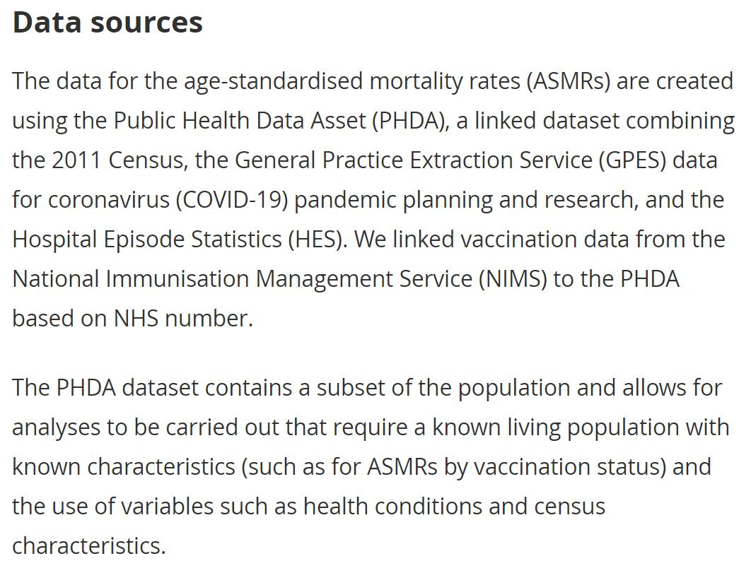
The report is stated as based on a subset of the English population but still relies on vaccination information from the National Immunisation Management Service (NIMS). It is a combination of the 2011 census data and GP records and named the Public Health Data Asset (PHDA).
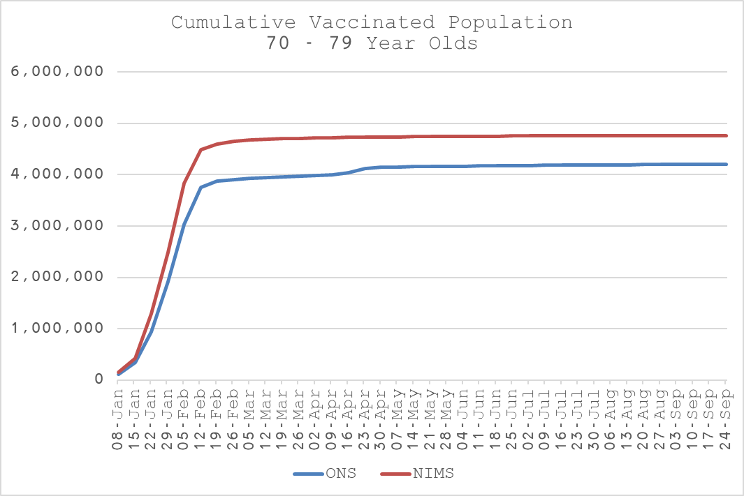
UKHSA, in their weekly COVID surveillance bulletins use the NIMS dataset too. You would, therefore, expect there to be a strong relationship between the two. Indeed, at first glance at the cumulative data, this appears to be the case.
By the end of the study, the ONS vaccinated population is 88% of the full NIMS dataset, after attaining that level in the 3rd week of April.
The deaths are almost the same too, with the ONS study dataset non-COVID deaths being approximately 87% of the full mortality database.
However…
When you break the relationship down by week, you see some very peculiar variations.
Evidently, the ONS subset of vaccinated population grows at a slower rate than the full dataset but then catches up during two distinct phases - 08-Jan to 12-Feb and 26-Mar to 30-Apr.
Curiously, these dates coincide with the 1st and 2nd dose rollouts respectively.
Even more curiously, if you plot the absolute weekly difference against the weekly vaccinations from NIMS, the picture is clearer. What is going on here?
The ONS dataset is systematically missing vaccinated people in the first few weeks and then some of them appear to be added back later. Very curious indeed.
So, what are we to make of this? Is there something fishy going on with the determination of the vaccinated population in the ONS report? If there is, might we suspect that the same fishiness is going on with the vaccinated deaths?
At the very least, you might expect the ONS to explain this in the Methodology section? Assuming, it was deliberate, of course. I mean, if it was a simple error, perhaps a double check in future would be useful, especially since draconian (some might say almost fascist) government policy and is being made off the back of it?
And people are relying on this information, conveniently fed to them with the exclusion of anything that contradicts it to encourage them to inject themselves in the belief they are increasing their chances of surviving the longest running pandemic in history.
If I was the ONS’s maths teacher, I’m afraid my report card would have to say “could do better” and we all know what that euphemism means?!
In Part II, I will do a forensic analysis on non-COVID deaths for 70 to 79 year olds…
https://www.ons.gov.uk/peoplepopulationandcommunity/birthsdeathsandmarriages/deaths/bulletins/deathsinvolvingcovid19byvaccinationstatusengland/deathsoccurringbetween2januaryand24september2021#measuring-the-data


Thank you. My family is waking up. I tell them do not take anymore vaccine or boosters. Ever.