Cooking the books, ONS style (Part III)
Hiding the damage caused by the vaccine by using the wrong population denominator
In Part II, we looked at non-COVID mortality and witnessed how the data presented by the ONS appeared flawed because it looked like deaths of vaccinated people had possibly been counted as unvaccinated.
In this penaultimate analysis, we’re going to look at COVID mortality and see if there is anything suspicious there too.
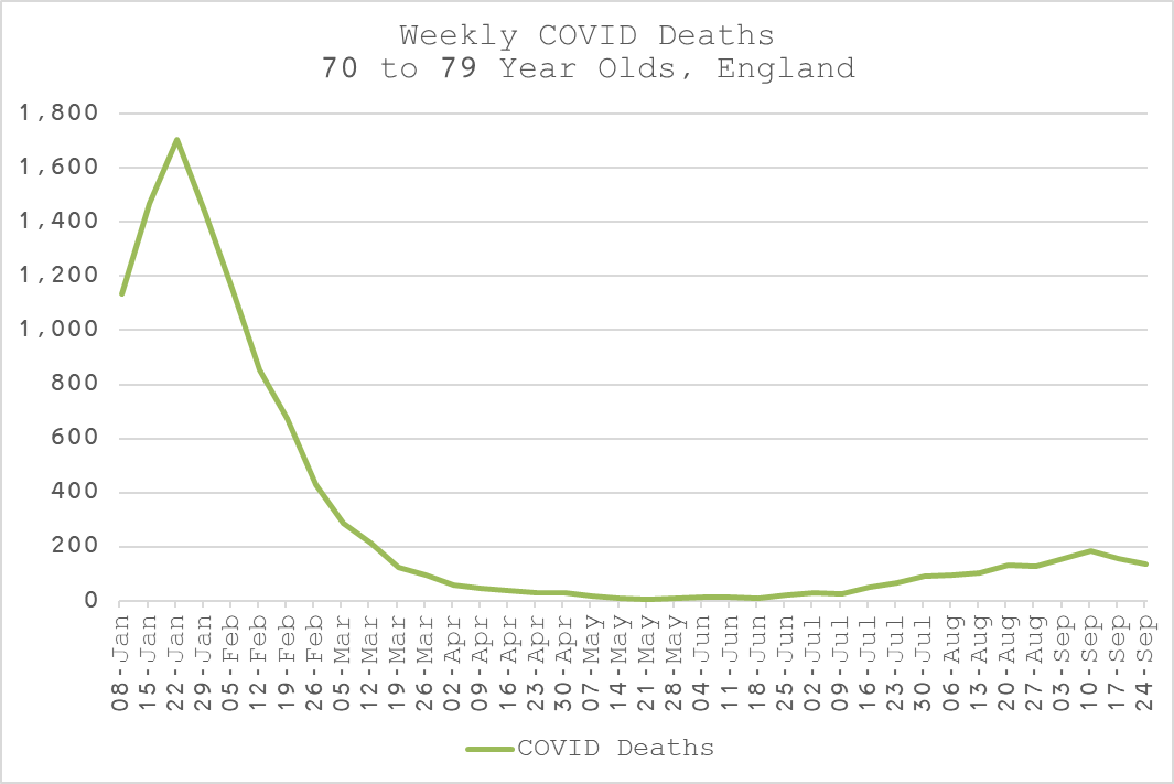
Looking at the absolute deaths data, we can clearly see the evidence of COVID from Jan to March.
This is during the time when the majority of vaccinated had only had one dose and were therefore not “protected”. This is according to the explicit claims made and supported by all those in favour of the narrative - “vaccines are good”.
When COVID myseriously returns in the middle of summer (!!), its impact is substanitally lower. Could this be because people have now had their second dose and it’s working? Yay!
According to the two statements above, therefore, we should expect to see similar age-adjusted mortality rates (ASMRs) for the vaccinated and unvaccinated in Jan to March and then higher ASMR in the unvaccinated after July.
Alas, in true ONS style, the data does not present a logical picture at all. If you believe this picture, you believe that dose 1 of the vaccine has a massive benefit and dose 2 actually makes things worse. [I still have that bridge for sale].
Note also that the vaccinated peak is 15-Jan, 1 week before COVID deaths peak and the unvaccinated is 05-Feb, 2 weeks after. Weird, right? Though no-one at the ONS seemed to be concerned about these oddities.
I am not the first to point out that this is probably due to the fact that the rate is calculated as a function of deaths and vaccinated population in the same week as death. For COVID, this is intuitively wrong. It is generally acknowledged that it takes about 3 weeks on average between infection and death. So, it would be more reasonable to count the vaccinated population 3 weeks prior to death and use that as the denominator when calculating the ASMR. Let’s do it!
OK, so we have a very similar pattern to the non-COVID deaths with the newly vaccinated dying at a significantly higher rate than the unvaccinated in the first few weeks, during which COVID was rife.
Once again, this makes much more sense. Given the policy of vaccinating the vulnerable first, it is inevitable that they would have a higher mortality rate, with COVID or without.
Furthermore, the scientific literature is already quite replete with evidence of immunosupression up to to 28 days after dose 1 which could only make matters worse for the really and less vulnerable alike.
And, as if by magic, both the vaccinated and unvaccinated peaks align with the absolute death peak on 22-Jan. Fancy that!
The more astute readers may have picked up on the fact that I haven’t had need to move any deaths from the unvaccinated back to the vaccinated where they probably belong. The task is more difficult with COVID deaths because the mortality rate is not constant. That doesn’t mean I don’t think there are some, just that this is possibly a conservative estimate of the vaccinated COVID ASMR.
So, contrary to what the ONS published about the unvaccinated being at 32 times higher risk of COVID mortality than the vaccinated, it is quite clear that the opposite is substantially true.
There is no apparent benefit after second dose, albeit with rather little COVID deaths to judge by but there is almost certainly a significantly higher risk immediately after the first dose. We have seen the same effect all around the world with boosters so this winter will probably give us more concrete and conclusive evidence (when the data is eventually released to us second-rate citizens).
Alas, it will be too late for many by then who will have died unnecessarily either through ignorance, coercion or even obligation.
Given that both COVID and non-COVID deaths are demonstrably worse in the vaccinated than the unvaccinated once we try to correct the ONS data using logical expectations, it is somewhat of a foregone conclusion what the impact of vaccination is going to be on all-cause mortality.
Nevertheless, in the final part of this analysis, I will present the conclusions based on this most important measure of vaccine benefit vs harm to public health in general.


amazing work here - is it possible to get the graphs for other age ranges too?
Thanks Metatron for your work here again. You are definitely up to something, but I am less convinced by the conclusion here. Note you use a 3week delay here (test reporting to death reporting), but 1week in your previous analysis. Might be plausible, but somewhat ad-hoc. Also, this is time-matched cohort, I have a hard time believing such a high mortality rate difference. Sounds more likely if they were vaccine induce deaths again. How many deaths per vaccination this would be, and how would it compare to the 1/1000 in the previous analysis ?