

COVID Vaccination is Making a Crisis for the NHS due to Staff Absences
FOI data released by Manchester University NHS Foundation Trust reveals that over 85% of absent staff are vaccinated and have driven absences substantially higher than during the spring 2020 epidemic.

Main Points
I’m adding this section after reading some of the comments as data that is clear to me is not always clear to others.
Before COVID, absences were at 1,800 per week.
During COVID, they were 2,800, peaking at 4,700.
After COVID, before vaccines, they were 2,600.
After vaccines, they are 3,400 per week, peaking at 5,500.
In very plain speak - overall, absences are substantially higher for COVID and non-COVID reasons since mass vaccination of NHS staff. Please ask the NHS, UKHSA and your local MP to explain this, not me.
It is well established that the COVID vaccines do not prevent infection or transmission. See here for the scientific proof.
This should already be more than sufficient science to go with the ethical case for not mandating vaccinations for healthcare workers.
Idiot Covidians like Piers Morgan, James Whale and even Jeremy Hunt will then chime in with unsubstantiated claims about the vaccines reducing severity of illness, thereby not putting undue pressure on the NHS.
I wonder how they’d explain the pressure put on the system by the huge increase in staff absences caused by those who are vaccinated?
According to an FOI request1, before COVID, Manchester University NHS averaged around 1,800 absences a week. During COVID (1-Mar-20 to 30-Aug-20), this number rose to 4,700 at its peak (29-Mar-20) and averaged just over 2,800. See Figure 1.
It immediately started rising again into the new season, again averaging around 2,800 before mass vaccinations started on 08-Dec-20.
For the period up to 02-May-21 it appears that the vaccinated have simply replaced the unvaccinated in terms of absence as the total number remained constant, albeit at an elevated level of 2,600.
Since May 2021, absences have incredibly averaged over 3,400, peaking at over 5,500 in the first week of January 2022.
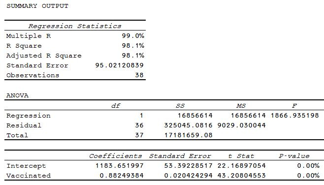
It is clear from the patterns in Figure 1, that the increase and variation is entirely driven by the vaccinated. This is not surprising given that up to 85% of absences at any given time are of vaccinated staff.
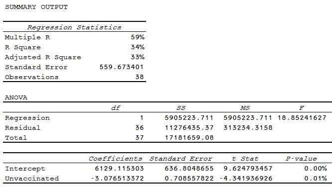
For the more statistically-minded, the explanatory power of the vaccinated absentees on total absentees is 98%, compared to just 34% for the unvaccinated.
For the less statistically competent, from 05-Dec-21 to 02-Jan-22, new absences rose from 3,653 to 5,568, an increase of 1,915. Over the same period vaccinated absences rose from 2,957 to 4,752, an increase of 1,795. Unvaccinated increased by 120 from 696 to 816.
If this dramatic rise was due to more staff being vaccinated over that period (however unlikely that would seem given they had resisted for a year already) then the unvaccinated would have had to have been negative 1,099 just to maintain the status quo.
Thanks again to the wonderful Clare Craig who suggested I also add reason for absence. Slightly different data from NHS Digital2 shows weekly absences rather than new weekly absences but it’s close enough. See Figure 3.
Once again, we can see clearly that on 02-May-21, with no COVID reason for absence (so the unvaccinated are the “control”), the rise in absences is due to non-COVID reasons and it is entirely driven by the VACCINATED.
Once again, we can clearly see that on 30-May-21 when COVID does drive the increase in absences, it is the VACCINATED that rise. The unvaccinated remain flat.
Once again, we can clearly see that on 05-Dec-21 when there is a massive spike in COVID-related absence, it is entirely driven by the VACCINATED. The unvaccinated are a blip in comparison.
Population-adjusted rates are entirely meaningless in the face of this. the bottom line is that the more you vaccinate, the more COVID and non-COVID absences you get.
Thank God for the NHS 100k3. Imagine how bad it might have been without them?

https://www.whatdotheyknow.com/request/covid_vaccination_status_of_staf_6
https://www.england.nhs.uk/statistics/statistical-work-areas/covid-19-hospital-activity/
https://nhs100k.com/
I can't be the only unvaccinated NHS worker covering extra shifts due to absent, triple-vaxxed colleagues who is looking at these data and reflecting on the power of anecdotal information.
Joel this is a great graph. I am just wondering what it would look like if the Y-axis is converted to a rate per 10k? I imagine the first objection from a Covidian to your graph and interpretation would be that the counter trend in injected vs un-injected is simply because of increasing numbers of injected staff. In other words, what you see is simply an effect of the decreasing pool of un-injected staff and the increasing pool of injected staff. Just a thought!