Going deeper on the ONS data - Deaths by vaccinated status 40 to 49 year olds, England.
It's not at all what it seems.
Luckily my daughter has done most of my Xmas present wrapping so I’ve been able to keep plugging away at the latest ONS report1 on deaths by vaccinated status.
Inevitably the higher non-COVID mortality in the unvaccinated than the vaccinated remains a great concern (more so than it was for the ONS apparently!).
Something we used to do when I was analysing financial market data that didn’t make sense was to invert the problem. This means making the necessary adjustments to the raw data so the output is what you expect then analyse the changes instead of the original output.
For this short study, I chose the 40 to 49 year olds. The reason was simple. 40 to 44 and 45 to 49 are the only age groups comprising the grouping used by the ONS that share the same European Standard Population. This means I could reproduce the age-standardised Mortality Rates (ASMRs) from the data they shared to support the report.
It worked out pretty well with a notable exception in the unvaccinated since March, where their ASMR was quite a bit higher than the underlying data produced. Never mind though because I used my calculations for this comparative study anyway. I just wanted to check my calculations beforehand.
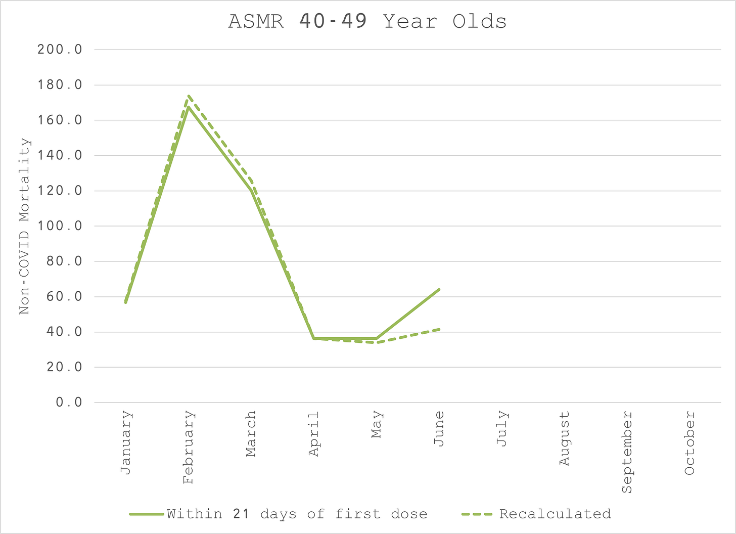
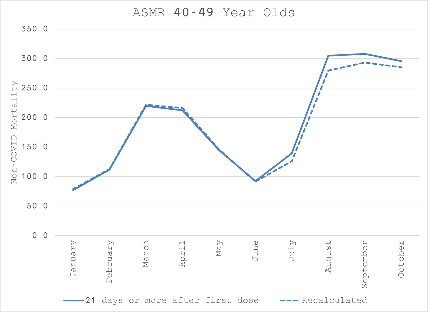
We can see that the total ASMR (deaths per 100k person-years) settles around the 100 mark by the time all the vaccinating is done. We can see some spikes just after each dose which we might expect given that priority was given to vaccinating the clinically vulnerable first.
What we don’t expect though is the kind of spikes we see in the unvaccinated. In fact, it would be more likely to see the opposite if those clinically vulnerable deaths are removed from the group.2
To keep things simple, I made the dose 1 and dose 2 categories homogeneous.
Now, on closer inspection, we see that the spikes in the vaccinated groups are coming from too low a level. They should at least start at the 100 mark and spike from there.
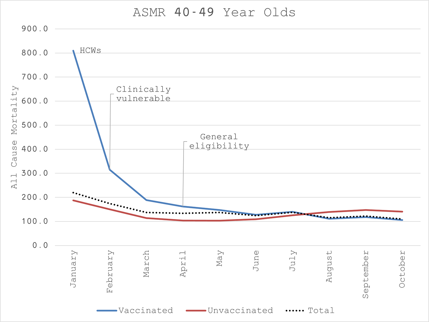
To make things simpler still, I then aggregated all the doses to work with a single “vaccinated” set to compare to the “unvaccinated”.
This begins to make some sense. January vaccinated is way too low relative to unvaccinated. You could argue that the Healthcare Workers (HCWs) who were vaccinated first are healthier than the general population - the “healthy vaccinee” effect noted by the ONS.
I’m afraid I don’t buy that argument (no disrespect to HCWs but I don’t think they are that much healthier, perhaps not at all). Even if this is the case, it’s a confounder that should have been controlled for because it makes a huge difference to the results.
From February to March we see a spike in the vaccinated. This would be consistent with the unhealthy vaccinated hypothesis, i.e. the clinically vulnerable have a higher probability of dying so if you vaccinate them first you should expect the vaccinated ASMR to be higher.
But there can be no plausible hypothesis for the persistent elevation of the unvaccinated non-COVID ASMR since April when the general group was generally eligible. It implies, or rather the ONS suggests, that the unhealthy decline the vaccine. That’s an awful lot of moribund unvaccinated and how come they weren’t included in the clinically vulnerable? It doesn’t make sense.
So, what to do?
Invert the problem!
Let’s presume the unvaccinated ASMR should always be at, or around the 100 mark. I conservatively assumed that the rate might be slightly higher in Jan and Feb even though there isn’t usually much of a distinct winter mortality effect for this group. I assumed 120 for Jan and 110 for Feb then 100 thereafter.
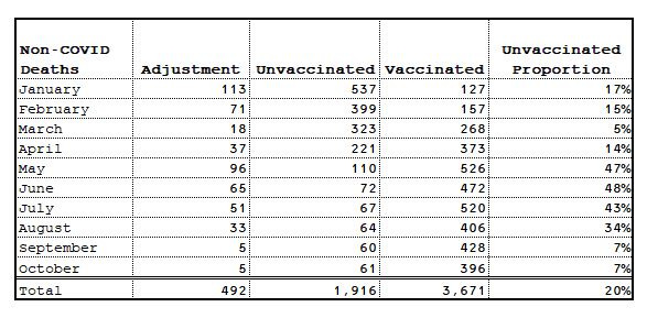
To achieve the target ASMR, I solved for the number of deaths in each month that would have to move from the unvaccinated to the vaccinated.
As you can see, this resulted in almost 500 deaths moving, 20% of the unvaccinated total. Is this plausible? I don’t think it’s implausible.
Inevitably the result is “reasonable” since that was the a priori assumption.
In fact, it’s more than reasonable. In “fixing” the unvaccinated, we actually end up with a rather nice-looking Gompertzesque distribution for the vaccinated. This is exactly what you would expect for a medical intervention with potentially fatal side effects where you systematically prioritise the clinically vulnerable. They die soonest, as do the other vulnerable with previously undiagnosed conditions that are brought on by the intervention.
More importantly, it converts a 16% risk reduction in non-COVID mortality for the vaccinated to a risk increase of 22% which is much more rational.
What might explain this situation?
My hypothesis is that those 500 died so soon after being injected that their NIMS record was not updated. I can’t concretely identify any misadventure by the ONS and I have no reason to believe they would do so. This hypothesis also does not rely on a mass collusion of HCWs. I simply believe it is an understandable administrative error.
To add further credibility to this hypothesis, I believe the same thing happens with dose 2 which explains the spike in dose 1 21 days+ that is concomitant with the plunge in dose 2 within 21 days between June and August.
I welcome any professionals who might give some anecdotal support to this hypothesis or anyone to provide competing hypotheses.
What is the implication of this for the overall conclusion?
As I mentioned in my previous report, the most important endpoint is all-cause mortality, not COVID mortality. Any risk reduction of COVID mortality is irrelevant if it is offset by a risk increase in non-COVID mortality.
As we also know from studying months and months of data, COVID is not a significant mortality risk for 40 to 49 year olds. So, before correcting for the anomaly, the all-cause ASMR timeseries has a very similar shape to the non-COVID ASMR one.
But the unvaccinated ASMR spikes and remains elevated between April and October, during a time when COVID was not even substantially present.
If we apply the same percentage adjustment to all-cause deaths that we derived from non-COVID mortality, something else plausible emerges. We retain the higher ASMR in the vaccinated until June when vaccination has pretty much finished.
We also see what appears to be a benefit for the vaccinated that survived the ordeal of getting to August unscathed when there was the unexpected re-emergence of the virus.
Whether it was the vaccine that finally gave them protection or it was simply a case of survivorship bias since they were the strongest to survive the first dose, is moot because overall the ASMRs turn out to be identical. Fancy that!
A 32% mortality risk reduction disappears into the autumn mist.
If I can get the deaths and person-year data for the other age groups, I’ll re-analyse the whole country, including the conspicuously absent 10 to 18 year olds.
Until then, Merry Christmas!
https://www.ons.gov.uk/peoplepopulationandcommunity/birthsdeathsandmarriages/deaths/bulletins/deathsinvolvingcovid19byvaccinationstatusengland/deathsoccurringbetween1januaryand31october2021
Note also the curious spike in dose 1 after 21 days between June and August at a time when dose 2 within 21 days plummets below baseline. I think it’s the same phenomenon.


Wow. This was a real treat. Merry Christmas. I was going to say, that probably something exactly like this is happening in the 12-15 or 10-18 as you mentioned.
There is plausibility in this thesis (about what the distribution ought to look like regardless of how the data might have been misclassified) - Denmark released a study of early vaccinations where clinically vulnerable and healthcare workers were targeted for early vaccinations in the last week of December. The result was brutal, 4x death rate after adjustment in the first few days of a dose. Likely similar things happened in the early days of Delta outbreak in April and May. Probably lots of 2nd dose deaths are quick and misclassified. I can see at least 1 instance of a hospitalization in a care-home that had an outbreak when they started vaccinating and 1 of 3 people hospitalized was said to be for non-covid related (meaning vaccine related). So it's totally plausible that this and some unforeseen nosocomial or hospital infections they were too embarrassed to report could explain the difference in unvaccinated.
Likely the advancing of mortality in the susceptible explains the consistent negative effectiveness against infection in the vaccinated population as the denominator just became much smaller than anticipated. I wonder what the numbers look like now that we are approaching the heart of winter.
The health authorities have no qualms in misclassifying deaths when given incentives to do so. Read my post https://live2fightanotherday.substack.com/p/beware-of-greeks-bearing-gifts
Massive vaxx induced cases and deaths in countries with no such things prior to vaccinations. And, as I write in https://live2fightanotherday.substack.com/p/beware-of-greeks-bearing-gifts-conclusions, it is plausible that this vaxx induced damage is only the tip of this iceberg, with 3/4 later attributed to excess mortality not related to Covid.
The 40-49 years old were vaccinated en masse Apr.-Jul. 2021, and as 3/4 of so induced deaths have been attributed to the unvaccinated (how honest are they with the 0-21 days post 1st or 2nd jab to be counted toward vaccinated, really?), there we have it. Taking into account the accounting shenanigans at every possible turn, in order to put more lipstick on a pig, this doesn't surprise me at all.
Hashes out with http://probabilityandlaw.blogspot.com/2021/12/possible-systematic-miscategorisation.html