Methodology for Estimating Excess Mortality #1
In pursuit of the most robust and reliable method... Linear fitting to the periodic data.
Introduction
There are many different ways to estimate excess mortality which, in very simple terms, is the difference between expected deaths and actual deaths.
As it happens, the process is not at all simple as both datasets are fraught with error.
You would think that “actual deaths” would be a straightforward metric. However, the first fundamental error made by many analysts is using registration-date data (when the death was finally registered), as opposed to occurrence-date data (when the death actually occurred)1.
There is also a common misconception that the registration-date data is more complete because it is published in a more timely fashion2. However, when produced at the same time, it contains no more information than the occurrence-date dataset, with the obvious exception that the latter has the information in the correct place. In other words, without knowing exactly when the deaths occurred, knowing only that deaths have been registered is not particularly useful for any analysis.
Nevertheless, this issue is typically ignored because the majority of deaths are registered within a few days of occurrence. Unfortunately, the majority of deaths are of very old people which obfuscates this issue for younger ages when the data is aggregated.
This leads to the second issue - aggregation. It is imperative to break deaths down into as small an age range as possible, so that the multitude of deaths of older people does not obscure any abnormal patterns in younger ages.
For convenience, when looking at whole population summary, aggregation should be done after all analysis of idiosyncratic ages is done, possibly expressed as lost life-years3.
On the point of age brackets, there is substantial variation in deaths stratified by age simply due to the fact that the cohort size changes from year to year, as a function of birth rates.
As can be seen in Figure 1 above annual live births in England & Wales have varied by as much as 300k over time. This stochasticity has diminished since the late 70s but will still have a significant impact on age-stratified analysis, all the same.
Consequently, stratifying by year of birth will yield much more robust and reliable data.
Finally, there are differences in mortality distributions between sexes (male and female). Stratifying by sex will yield better results than aggregating sex.
Estimation of expected deaths is somewhat more problematic than collecting actual death data.
The most naïve analysis relies on taking some historical period average. There is, however, often dynamics in the historical series that should be accounted for. The series may follow a linear trend or even an exponential one. And, even then, consideration must be taken whether that trend is expected to continue, taper off or even reverse.
Moreover, periods of known abnormality should be excluded from the calculation. Again, this should be obvious but many official analyses commit this error.
Finally, time period must be considered. Daily data is most useful for time-series analysis but could be too noisy for cross-sectional analysis. Moreover, given the seasonality of mortality in England & Wales, especially in the older ages, aggregation of time periods should be selected carefully in order to capture contemporaneous events.
Similarly, to measure the potential impact of other exogenous events, like the emergence of a novel pathogen or a public health intervention, for example, other periods may be appropriate.
Methodology
Taking all the points mentioned in the introduction into account, this methodology is proposed.
For each single year of birth, calculate the actual weekly deaths by date of occurrence, between 2015 and 2023.
Fit a linear regression through the data between 2015 and 2019, so as not to be impacted by the abnormal events of 2020 onwards.
Derive excess mortality as the difference between the actual data and the linear regression.
Figure 2 depicts the first three steps of the methodology, using 1942 as the year-of-birth cohort. As can be seen, the results look reasonable, as, indeed, they look for all year-of-birth cohorts all the way down to 2008.
N.B. Since the data is for a fixed year-of-birth cohort, the series is expected to be upward sloping as that cohort gets older each year (and older people die in greater numbers than younger ones). This progression is expected to peak and roll over at a certain old age, as the depleted cohort results in fewer deaths until there are none still alive. This effect was not apparent in the data available which cuts off at 1935 year of birth (aged 88 in 2020).Add the weekly excess deaths to produce a cumulative tally.
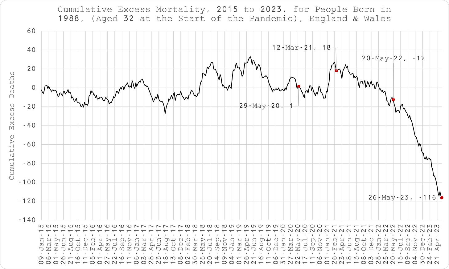
As can be seen in Figure 3 above, in normal times the series should oscillate around zero as a result of seasonality and pull-forward effect (periods of excess death must be followed by a deficit at some point since people can only die once).
The weekly time-series data shows obvious inflection points that can be compared to exogenous events.Produce a quarterly series (March, June, Sept and Dec which conveniently does not overlap seasonality and also accommodates the public health interventions in response to COVID). This time, fit a polynomial to the cumulative data. Again, in the absence of cohort depletion, this curve is expected to be exponential if the weekly data fit is linear. The decision to use a 2-order or 3-order polynomial was made by reducing the difference between the cumulative excess mortality derived from the quarterly data and the weekly data, at the same time point (Mar-23).
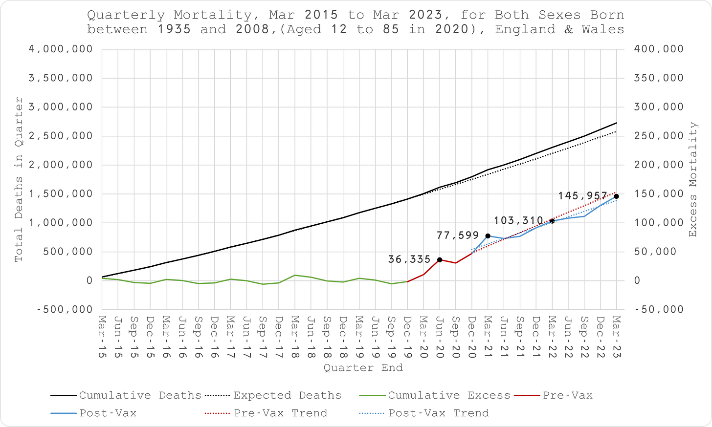
Aggregate the data for summary presentation (Figure 5).
Limitations
Since the ONS does not produce age-stratified deaths data by date of occurrence, a user-requested dataset was used, meaning this analysis can only be done on an ad hoc basis, as and when the ONS provides it, after payment of a substantial fee.
This dataset contains daily deaths occurrences by single year of age. As a result, year of birth could not be broken down into more finite cohorts than single year, which in turn, was derived by single year of age. It is, therefore conceivable that people in the same cohort could have almost 1 year difference in birth year which was taken as the simple difference between year of death and age at death, both as provided by the ONS. Furthermore, this dataset was not stratified by sex.
A request has been made to the ONS to quote for data stratified by single month of birth and sex which would overcome these issues.
The data only spans 2015 to 2023. The derivation of baseline (expected deaths) may be subject to error since the assumption of linearity in the actual underling periodic data series over 5 to 8 years may not be correct. With more data, it may be apparent that the data follows a different distribution.
This may be particularly pertinent for those born between 2004 and 2008 (aged 12 to 19 between 2020 and 2023). Although the historic data is linear (Figure 6), there could be an unknown change in convexity which could only be identified by looking at earlier age cohorts as they went through the same change in age.
As a result, this undetermined convexity may result in overestimation of excess deaths (Figure 7).
It was only possible to test this “unknown convexity” hypothesis with data for years of birth 1999 to 2003, given the mortality data date range (imputed ages 12 to 21).
Between Mar-15 and Mar-20, there appears to be potential convexity for years of birth 2003 (12 to 17 year olds), 2002 (13 to 18 year olds) and 2001 (14 to 19 year olds), perfect linearity for 2000 (15 to 20 year olds) and actually concavity for 1999 (16 to 21 year olds) (Figure 8).
This does not conclusively suggest the existence of some persistent convexity that is not captured in the 2004 to 2008 cohorts. It may be that there is convexity between 12 and 19 that flattens out once age 20 is introduced and then turns concave with the addition of age 21 or it might just be that all the convexity and concavity is due to artefacts in the limited data series and the short integrals are really linear as assumed. More data is necessary to resolve this issue.
This issue may also be apparent in the older ages where the difference between the implied excess using the two different methods is greatest. Again, with more historical data, the convexity that produces these discrepancies could be deduced.
Ultimately, though, reliance was made on the polynomial fit to the cumulative data which would not be subject to the issue of mishandled convexity.
The effect of registration delay is most apparent for those born between 1972 and 2004, increasing substantially for younger ages (Figure 9). As a result, excess mortality in recent periods, potentially going back several months, is going to be underestimated.
You would think that the potential pitfall of this would be obvious. It is akin to the police investigating a crime by scrutinising the activity of the suspect on the day the crime was reported rather than the day it actually took place.
Since 2020, the ONS started publishing occurrence-date data on a weekly basis as they have done with the registration-date data for some time. However, it is not stratified by age so it is not particularly useful.
The difference between age of death and expected remaining life, according to actuarial life tables.


What i do see are many vaxxed people just shrugged their shoulders non-chalantly, because they can only and will only relate to themselves not having problems or side effects from the jab and in the process had to accept their own safety as scientific proof that this illness does not exist. Assuming their body not being affected as the one and only sign of pure science. Almost as if the human empathy and sympathy just vanished into thin air. Many are just look the other way.
Just had this thought that I’ll share in comments on all the SUBSTACKS I subscribe to…
Howzabout a daytime rally of the jab-injured in baseball/football stadiums across the nation. There are enough ambulatory jab-injured in the various cities to fill the stadiums, and they need visibility and a voice. A millionaire or 2 (perhaps jab-injured themselves) would be needed for the rentals, or perhaps a crowd-sourcing campaign.