New Zealand - Deaths by COVID Vaccination Status
What the data really tells us. Spoiler alert - nothing useful! Just more confirmation that the available public health data is not fit for purpose.
First, apologies for lack of activity. As some may know if you read my comments on the last post, after almost 4 years of fighting the globalists and their apologists, time came to refocus on everything else in my life that I have neglected.
Nevertheless, while I am still waiting for the ONS to even give me a final quote on the dataset I need to do a final, comprehensive mortality analysis on England & Wales (using proper methodology, unlike the tripe they recently put out themselves), I was prompted to take yet another look at the New Zealand data (thanks, Doug!).
Much has been made of “sensational” new data that NZ “authorities” were compelled to publish under FOIA, regarding deaths by COVID vaccination status.
I’m sorry to have to rain on the parade. I have to be honest and tell you what the data tells me. It tells us nothing.
The problem is - there is no control group.
It’s impossible to get reliable data on the rate of population that is “vaccinated”, especially broken down by age. Like most countries, NZ does not publish this valuable information but I did manage to track it down, buried deep in a Github repository.
After painstakingly downloading and tidying up every weekly file and combining them to make some sensible data, what did I discover? This…
Evidently, we cannot rely on data that shows 105% of the over 60s population has ever been vaccinated! I have marked the point at which I think NZ Ministry of Health screwed things up - 12th Jan 2022. Even at that point, with more than 97% of the population “vaccinated”, you can’t do any reasonable analysis of data stratified by vax status. It will reveal nothing but confounding.
And so it probably does:
The above is my representation of the chart doing the rounds, showing that there is no correlation between COVID deaths (nor non-COVID deaths as it happens - see appendix) and the unvaccinated population. My chart does, at least, have an appropriate scale and does appear to support that counter narrative.
But, really, all it shows is that the unvaccinated over 60s in New Zealand are probably healthier than the vaccinated ones. Sure, there is probably something in that but it does not support the counter narrative that the jab is, therefore, killing people (even though that’s what I believe based on the collection of lots of other data, like the next section, for example).
You can take a look in the Appendix at the bottom for some other nice charts that got me to that point (again, after much tidying up of the official data which, unsurprisingly to most by now, is an absolute mess).
Interestingly though, COVID only started in NZ in Jan 2022 (again, as we already know, literally at the point that all the relevant people had been jabbed!), which is why it’s appropriate to focus on the data from then on if we are that concerned with trying to make sense of the impact of the jab on public health.
And, there was one real nugget of information I discovered whilst trawling through and analysing the available data from the official statistics site.
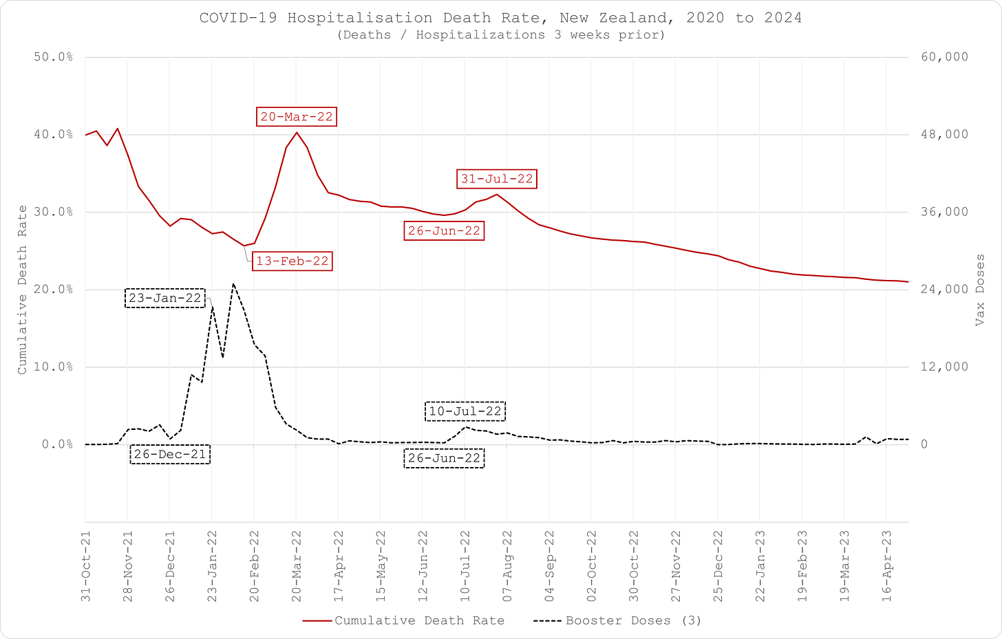
I was able to construct a meaningful COVID hospitalisation death rate for the over 60s - COVID attributed deaths divided by hospitalisations 3 weeks prior (again, look in the Appendix to see why I chose that offset).
So, how’s about that then?!
The rate is trending steadily downward (as you would expect, again because we’re all pseudo-expert epidemiologists by now!) but has two really obvious inflection points on 13th Feb 2022 and 26th June 2022.
I couldn’t see any investigation into this by Public Health NZ so I had to do my own…
Seems rather curious that both these spikes in mortality rate should occur in sharp coincidence with the booster campaigns, no?
But I’m afraid, that’s about all the NZ data is useful for because they did such a great propaganda job on the the relevant population that the necessary control group is missing and the data required to construct proper mortality rates (by age and vaccinated population) is either unavailable or unfit for purpose.
Seems to be a recurring theme?


What I appreciate about your substack is that you do not have an agenda other than to share data with explanation (because although I play a doctor on TV, I am not one, or an epidemiologist or a statistician ha ha ha) and then let us read, see and make an educated conclusion. So thank you for this.
Even more amazing it the fact that after having achieved 105% ‘ever vaccinated’ we somehow reduced to ~101% ‘ever vaccinated’. A scene from Princess Bride keeps invading my mind, “I don’t think that word means what you think it means.”