We flattened the curve!
A quick analysis of excess mortality distributions in England between 2019 and 2021.
We did it, Patrick, we flattened the curve!1
Or did we?
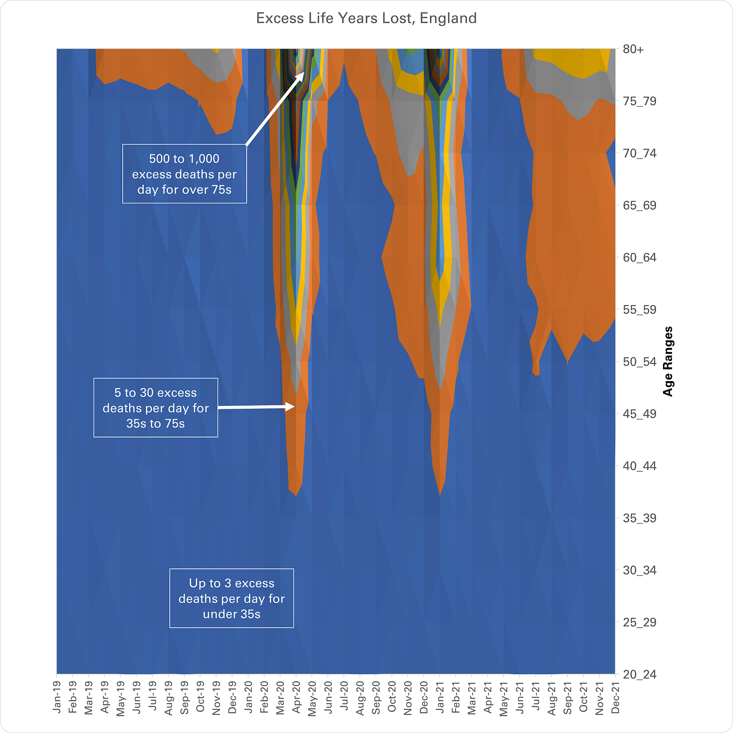
What this chart shows is that COVID is a complete non-event for anyone under 35. Should have just carried on life exactly as before. Best thing you could have done is get infected and “do your bit” by providing protective community immunity for the more vulnerable. Who knew?!
It also shows that we do, indeed, now have flatter mortality distributions than before interventions. In other words, excess mortality spans wider time periods but with lower peaks. We substituted “normal”, natural fluctuations in mortality due to seasonal, respiratory pathogens with permanently elevated levels of mortality instead.
However, as I have shown in my previous short analyses, those spikes in mortality in spring 2020 and winter 2021 weren’t due to the virus anyway! They were also as a result of the interventions. We didn’t flatten anything, we squeezed it up and then fattened it up like a French goose!
Finally, we also managed to democratise the mortality by shifting deaths from the very elderly down to the younger members of society. Well, I say shift, but you can see that, in fact, we’ve ended up with wider mortality distributions in the over 70s too, compared to pre-COVID, but with the same peaks!
So, really, the only result is permanently more middle-aged deaths on top of the extra middle-aged and old-aged deaths caused by the interventions at the time.2
Never mind. At least we saved the NHS! Clap Clap!
For those struggling to interpret the chart, it is a 3 dimensional contour plot with time along the bottom, age ranges along the side, looking down on levels of excess mortality expressed in life years lost rather than absolute deaths.
For me, it looks intuitively like headlands jutting out into a sea and this is a good way to interpret it. The “sea” represents a normal level. The “land” area represents abnormal levels of deaths that can be acute and short lived like Sharp Point in California:
Or, they can be broader and flatter like the White Cliffs of Dover!
Reference to Patrick Star, the stupid echinoderm in Spongebob Squarepants, not Patrick Vallance, the stupid UK government Chief Scientific Adviser.
For context, the orange areas are the equivalent of a mini bus or coach load of 50 to 75 year olds, respectively, crashing every day and killing everyone on board, the sort of thing that would at least make the headlines of the local newspaper in pre-COVID times. That’s where we are now and there are no mainstream journalists remotely interested in covering the story.


I think the only curves that have been flattened are IQ distributions. *Thanks for the shout out BTW*
We flattened humanity! Thanks Whitty, Valance, Hancock, Johnson, Sedwill, Cummings, Ferguson, WHO death merchants, Deep State ghouls, Gates, parasitic Malthusian elite. Thanks.