Another Definitive Guide to Excess Death During the COVID Era
European analysis with methodology - the wealth of nations determines COVID mortality outcomes, especially in the post-vax era.
The Daily Sceptic very kindly featured my excess death analysis based on OECD data. However, a few people challenged it on the basis that the results were different from the chart that Our World in Data puts out.
My response was that it is due to different methodology. There are, of course, myriad different ways to estimate “excess deaths”.
Anyway, I am redoing that analysis using raw data from Eurostat and my own methodology that I describe fully at the end in the interests of complete transparency.
Let’s start with the result:
Oh no! It looks like I got it wrong!! Sweden is not the best performer in Europe in terms of overall excess deaths (this time up to 28-Aug-22).
Still, Sweden appears to have done pretty well considering all the bad press it got in the first few months of the pandemic.
And before we get all the “yeah, but” look at its neighbours comparison, let’s engage the thinking matter first, shall we, and first establish what a reasonable comparison is?
Looking at the correlation matrix (truncated here for display purposes only), we can see that Sweden does not actually have much in common with any of the other countries, except moderately with Belgium and France. It’s a shame that we’re still waiting on the ONS to publish the England data by occurrence date so I could include that in this analysis as I’m pretty sure England will be the best match for Sweden.
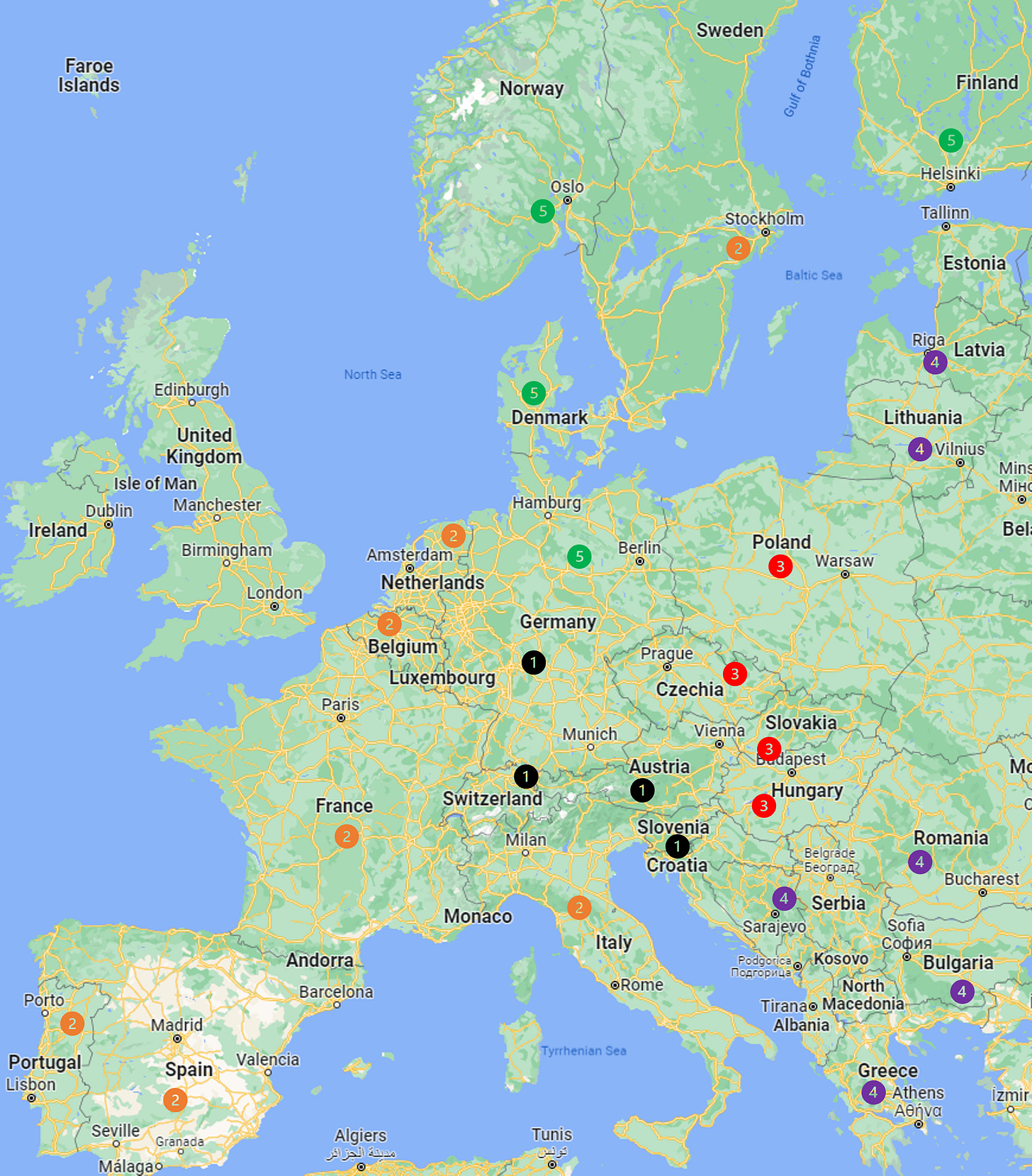
All the same, we can use this matrix to group the countries according to those with which they have the strongest historical relationship in terms of mortality distributions1. (See Methodology section below for description of how I systematically arrived at these groupings).
In case you’re not intimately familiar with European geography, here’s a map:
Do you notice something coincidental?
Yes, of course, geography! The countries with the most similar mortality patterns also have similar longitudes. I still remember when I was told off for making this obvious observation because I’m not a “geoscientist” or some nonsense like that. But, I also know that geography covers people as well as places, so perhaps it’s something to do with demographics or socioeconomics more than climate, etc.?
Nevertheless, regardless of my lack of credentials, the fact remains that mortality patterns in Europe follow a longitudinal process and I remain open to collaborate with a subject matter expert to help explain this phenomenon2 or anyone else who can explain it in terms outside of physical geography whose correlations may be spurious.
Now, when we look at the excess mortality by group, Sweden wins again! Hoorah! We’ll start then with Group 2.
I couldn’t tell you why Sweden should (almost) fit with western Europe (I’m not a geoscientist, remember) but historically it has done and during COVID it did (to a large extent as well). Note that Portugal is also a bit of an outlier but group 2 was the best of a bad lot for the Portuguese as well.
If public health authorities really did want to get to the bottom of why some countries fared much worse than others then they should look at the fundamental differences in the demographics and health economies of Italy and Spain compared to Belgium and France, for example, or the respective severity of the measures taken by those countries, including how aggressively they “vaccinated”?
For Group 13, with the exception of Switzerland (which is really on the cusp of East and West Europe as determined by the mortality boundaries), COVID does not emerge at all until mid Oct 2020.
For the record again, this is why I do not fully subscribe to the “healthcare fragility” hypothesis. If the excess deaths were primarily caused by the measures then why don’t we see any excess death in this region despite them having the same measures as the countries further west? Yes, the measures most likely exacerbated things but I maintain COVID had to be present and virulent enough to take advantage of that?
What about the disparities in this group? Is it obviously a wealth gap? Or something else?
Similarly for Group 3, during the epidemic phase of spring 2020, this group evidently experiences much lower seasonal deaths than usual and then gets hit hard in the following autumn.
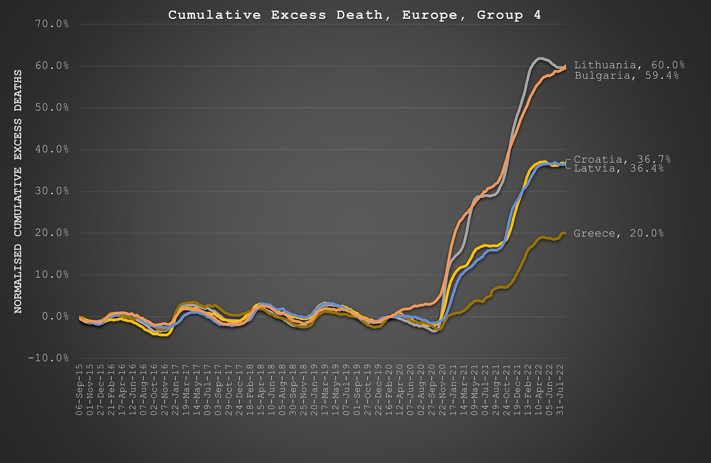
For Group 4, we are furthest west and inevitably, again, there is no COVID (excess death) until mid-Oct 2020 - except in Lithuania. What is special about Lithuania that they got excess deaths since spring 2020 before the rest of the group caught up, only to pull away again in summer 2021, ending up with the worst outcome across the whole of Europe? As I recall, Lithuania was the worst for “interventions”, making the Nazi-style policies of Austria look benign?
And so, finally, to Group 5, where Sweden is conspicuously and legitimately absent. Meanwhile, Finland (a bit like Lithuania but on a relatively smaller scale) seems to have flown under the radar in terms of experiencing worse outcomes than one might expect given its truly comparable neighbours.
Perhaps, the COVID zealots should finally give Sweden a rest and investigate what went on in Finland instead? The answers might be better for public health.
And while they’re at it, perhaps investigate why excess deaths don’t shoot up in Norway and Denmark until Sept 2021, 18 months after COVID first hits the scene and six months after everyone has been “protected” from it with the experimental gene therapy?
But what about that “vaccine”?
The most obvious observation is that there is substantially more excess deaths after the vaccination campaigns than before.
But then, at first glance, there seems to be a a negative correlation between vaccinated population and excess deaths since the start of the campaigns:
But then there is a similar correlation between excess deaths and GDP:
Which is the spurious one? I mean Bulgaria does have the lowest vaccination rate and the joint highest excess death rate but what about Lithuania? It has one of the highest vaccination rates?!
Conversely, both Bulgaria and Lithuania have the lowest GDP.
In fact, the correlation with GDP per capita (a measure suggested by a reader) is a significantly better correlate - but only since the vaccination campaign:
Some hypotheses to consider:
Are poorer nations less well equipped to deal with vaccine injuries?
Do poorer nations feel the impact more of diverting healthcare activity to vaccination campaigns instead of treating patients for real illnesses?
Do poorer nations have worse metabolic health due to poorer diet which makes them more susceptible to the vaccine pathology?
Perhaps, instead of “vaccine equity”, more attention should be paid to healthcare equity in general if the intention of public health is genuinely to act in the interests of public health (as opposed to the financial interests of Big Pharma)?
Further Reading
Comparison of European deaths - More vaccinated countries have had more recent death, HART.
Methodology
I took the raw data from Eurostat for weekly deaths and filtered out the countries with incomplete data or too few deaths to model.
For the remaining countries, I did a simple linear regression through the weekly deaths between 6-Sep-2015 and 23-Feb-2020, being the start of the usual mortality season across Europe up until the point that no material interventions were made to “deal with” COVID. This method will produce a trend that captures the impact of severe peaks and troughs as well as the general change in mortality over time. I like this because it compensates countries who typically have severe reactions to mortal pathogens.
I calculated the excess as the difference between the baseline (the linear regression model) and the actual reported deaths, having extended the baseline through to the end of the study period (28-Aug-22).
I calculated the “normalised” excess by dividing the cumulative excess by the cumulative baseline.
For the country groupings, I took each of the two highest correlated pairs in terms of weekly deaths. Where a country was in more than one pair, I combined the pairs, and so on... For example, Austria is most highly correlated with Switzerland but Germany is most highly correlated with Austria so those three countries end up in the same group together. Slovenia is most highly correlated with both Austria and Switzerland so in she goes as well. I’m sorry if some people think this is “arbitrary” but all modelling is arbitrary. It is, however, systematic, consistent and completely logical and reasonable!
Like Sweden, Finland is also a bit of an outlier that does not really fit with any of the other countries to the same extent that they correlate with each other. And oddly enough, Sweden and Finland aren’t particularly like each other either!
Imagine if this was done when I first reported this phenomenon back in summer 2020, how much economic and health damage could have been avoided due to the recognition that measures were not responsible for better COVID outcomes east of Germany?
Arguably, I could have combined groups 1 and 5 (through Germany) but it doesn’t change much in the final analysis. Moreover, Germany sits right on the cusp of the divide. So too, you would not be unreasonable to combine groups 3 and 4 if you looked at the second highest correlated pairs.


I’ll bet there are certain people who wince each time a new analysis appears from Joel Smalley.
You see, it’s not possible to hide what they’ve done or been complicit in lying about.
Unless the authorities are lying about the number of dead people, the evidence of multiple crimes is in the data.
Some people point to certain datasets & exclaim “look, entirely consistent with the official narrative”, as if that dismisses any & all objections.
Sorry, it doesn’t.
ALL the data needs to be consistent with the narrative, with plausible, non-overwrought explanations for deviations.
And they just don’t fit.
Exactly what the truth is / was will be debated for ever.
But we can be absolutely certain that all the deaths are not consistent with a viral pandemic plus some unfortunate consequences of policy.
Many people were murdered. Medical protocols designed to kill. Things you’d never do we’re done to tens of thousands of innocent people in each country.
Some people were all but frightened to death then treated inappropriately or not at all.
What’s worse is that a large number of medical staff know full well what I’ve said is true, yet are still drawing their taxpayer funded salaries.
Where it comes to the “vaccines”, there’s no question that this was an irrational policy response. Even if they’d done a good job of design (they didn’t, it couldn’t have been worse); of non-clinical toxiciology (they simply missed out numerous packages); of clinical development (they committed trials fraud); of manufacturing (ha ha), they still couldn’t have saved lives.
Early multi drug treatment would have been the correct response, assuming there really was a novel virus (I don’t think there was).
So the “vaccines” are superfluous, ineffective & toxic.
Other than that, anyone who wishes to believe the official lies - about how people died & the role of the injections - is welcome to knock thrmselves out.
Canadian MSM reports that COVID-19 related deaths this year have surpassed all of 2021 yet doctors still say; “Fortunately the vaccine has protected many from severe outcomes".
How are more deaths not more severe outcomes?:):)