Safe and Effective™? 25,000 surveys dead or alive and two questions that prove or disprove the COVID vax narrative, Conclusively.
Do you want to know the truth? This is my most important article ever.
This is my most important article ever.
Since I introduced this solution to end the Safe and Effective™ debate, I almost immediately fell into my own trap of being distracted by the more complex, scientific explorations of the deleterious effects of the mRNA experiment1.
As further proof, here is an attempt by the pro-vax scientists to frame the experiment in a good light by alluding to the “millions of lives saved” mendacity, the author, no less, of the study that inadvertently showed a plausible mechanism of harm2:
So, this one is for you Kilian and all the other pretend scientists who are so quick to revert to dogma when their beliefs are threatened.
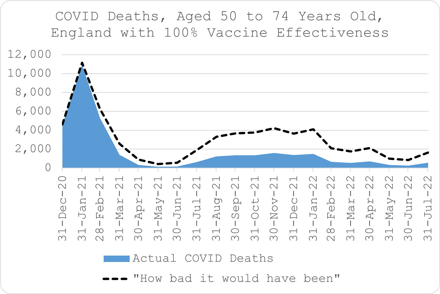
If the vaccine saved millions of lives, in fact if the vaccine saved any lives at all, this is how it might look:
The chart above represents how the proportion of deaths that are unvaccinated people aged 50-74 years old in England would look if the mRNA jab was safe and 100% effective as per the original claims (thereby averting every single vaccinated COVID death).
If we assumed that all the COVID deaths were in the unvaccinated and scaled them up by the ratio of unvaccinated population, over 25,000 50-74 year old lives in England might have been saved:
Alas, not even the most ardent branch Covidian still believes the false narrative of 100% protection in the real world.
But, we can test the hypothesis in the real world with a very simple sample and determine conclusively how many lives were saved (or not).
To produce the first chart, all we need to know is how many people died, how many of the deceased were ever vaccinated, and what proportion of the population was ever vaccinated at the time they died.
Aaaarrrgggh! But I said last time that we don’t know any of this information, didn’t I?!
Well, here’s the thing. If you ran just twenty surveys of 1,250 people, you could estimate the true vaccinated population very accurately:
The chart above represents a simulation3 of just that, where you survey 1,250 random people, split them into 20 groups representing each month from Dec-20 to Jul-22 and ask them this single question about the month they have been randomly selected into:
Had you ever received at least one COVID vaccine by this time? Yes or no?
That’s all that is required. You then aggregate the results of the twenty surveys of 1,250 people, i.e. 25,000 in total. That’s a mere 0.1% of the population aged between 50 and 74 to get a very good estimate of the true vaccinated population rate, as opposed to the officially reported one which over-estimates the number of people vaccinated and/or under-estimates the total population.
You then randomly select 25,000 people aged between 50 and 74 years old who died during the same period. That’s about 10% of all the deaths. And you ask someone who knew them:
Were they ever COVID vaccinated? Yes or No?
If you aggregate those results, and combine them with the results of the survey of alive people4, you’d get the chart below:
Even just looking by eye at that chart on its own, it would be clear whether or not the vaccine saved lives. We could also compare it with the first chart.
Safe and Effective
The chart below shows how the unvaccinated are represented with 100% safety and effectiveness, i.e. the difference between the proportion of deaths that are unvaccinated and the relative population that is unvaccinated (the difference between the solid black line and red dotted line in the first chart at the top of the article):
Safe but Ineffective
The next chart below is how the unvaccinated are represented by the random survey, assuming the vaccine is safe but ineffective, i.e. a placebo:
It’s a very simple mathematical test to determine if the actual survey results above are random like the latter chart or evidence of systematic effectiveness like the first one. It wouldn’t even be a matter of interpretation. It would be mathematically one way or the other.
Of course, we could also test if the “vaccine” is unsafe as evidenced by negative representation of the unvaccinated at various times.
Unsafe but Effective
Here’s how the chart looks like if the experiment was unsafe but effective, i.e. it saved you from a COVID death but was just as likely to precipitate your demise from something else like thrombosis or cancer:
The patterns are easy to recognise, aren’t they? But even so, again, simple statistical analysis of the results would reveal unequivocally whether or not there was a relationship between deaths (COVID and non-COVID) and the “vaccine”.
Inevitably, we could also do unsafe and ineffective, and also unsafe and negative effectiveness too. You get the gist? And yeah, that last one is actually the front runner now in terms of hypotheses.
But there’s no need to speculate.
The pushers set the narrative - Safe and Effective™. So, all that is required to defeat the narrative is either:
periods of negative unvaccinated representation when there is low COVID mortality - vaccine is not safe;
or
periods of insignificant over-representation when there is material COVID mortality - vaccine is not effective.
And all it takes is surveys of 25,000 alive people and 25,000 dead ones.
If they really wanted to know the truth, the government could sponsor this and get the results in a very, very small fraction of the time and budget provided to set up a useless track and trace system.
Do they want to know the truth?
Do you?
Personally, I just can’t help it. I’m an addict now for all the information I can muster on the subject, as much as I want to let it go.
To generate the simulation, I started with the “unknown”, true vaccinated population rate and randomly generated numbers from 1 to 100. If the number was above the vaccinated population rate for the month of that draw, that would indicate the random sample was an unvaccinated person. If the number was below, it would indicate the random sample was a vaccinated person.
The unvaccinated population rate has to be 1 (or 100%) minus the vaccinated population rate.


I noticed with great interest that Joel’s approach here eliminates any need to determine cause of death. That’s very importantl, because the clinical diagnostic technique, being PCR-based, is awful and in no way can be trusted or relied upon.
Look 👀 out the “Corman Drosten Review” article for details of how deliberately misleading the procedure is.
Stripping back the logical analysis to compare only all-causes mortality by “vaccination” status is a needed review of the data and which, if conducted in an even handed manner, will yield answers to the scenarios that Joel has posed.
Will officialdom run such surveys?
Will they heck.
All vaccines are poison. Vaccines create disease.
Anyone who has studied the topic in depth knows that every aspect of the "vaccine story", starting back in the 1800's up to present, is complete fraud. Vaccines have done nothing but harm people and line the pockets of the medical establishment.
Vaccines are barbaric- all of them.
There has never been a product of any kind so filled with historical misinformation, purposeful deception and outright fraud.
The belief that injecting synthetic chemicals made by habitually criminal companies who profit from perpetual disease somehow produces health is not only ridiculous and unproven— it is a foundational teaching of a dangerous religious cult that western medicine has become.
From their inception to today's mRNA monstrosities vaccines have done nothing but cause massive and systemic harm to the human biological system.