When Will You Die?
A novel approach to estimating mortality risk, using Gompertz distributions.
Here, I briefly present the interim results of my continued research into mortality and longevity risk. I have refined my Gompertz model, using a logarithmic model of empirical death-age data, to help calibrate the model with otherwise sparse input data.
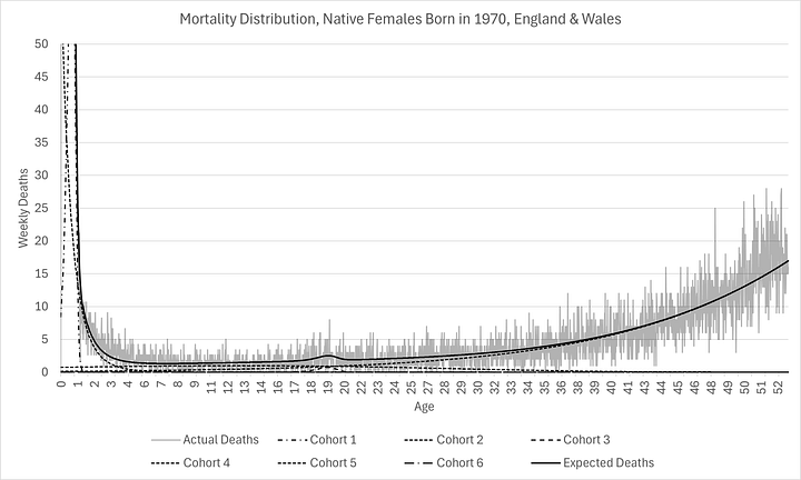
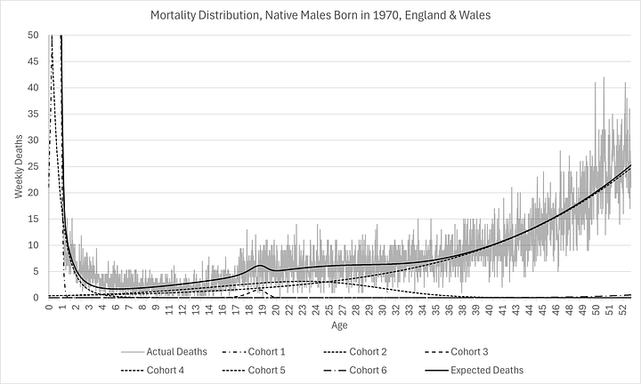
As you can see below, I have managed to construct the entire mortality distribution for those born in 1970, calibrated with just 6% of the cohort already being deceased:
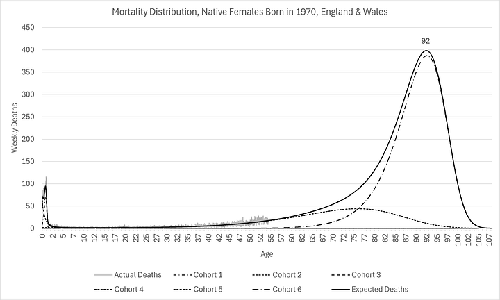
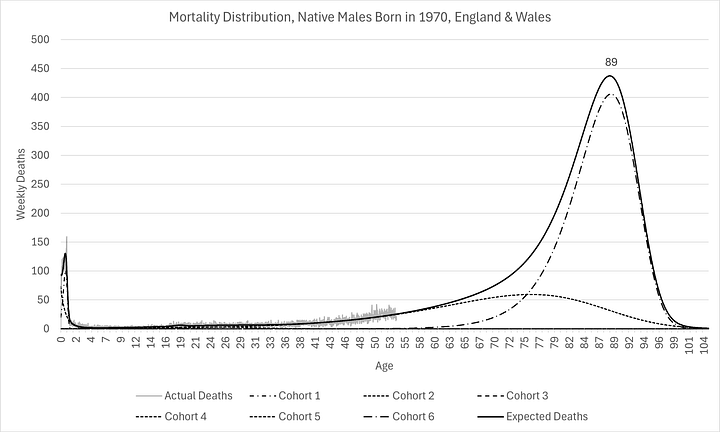
I chose those born in 1970 as an example, not just because it is my own birth year(!), but because that’s the year in which the ONS is first able to produce reliable mortality data (by occurrence date, stratified by sex and birth year). Using birth cohort 1970 for only natives to England & Wales meant it was also possible to constrain the calibration to produce the exact number of deaths as there were births.
As you can see above, expectations are remarkably similar now for men and women, something that has not been the case historically. They have similar modes (labelled on the charts). However, there are substantially more females expected to die at the mode than men.
This is evidence of “mortality compression” which is consistent with Kannisto (2001)1. In other words, even though there is little improvement in oldest age at death, there are more and more people living longer, causing the mode to rise, as well as shift (a little) to the right. I think this has profound implication for healthcare provision over the next few decades.
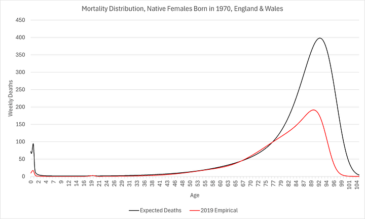
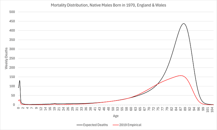
In the charts above, the “empirical distribution” is the actual, recorded number of deaths for each age group in 2019. This is substantially different from the prospective distribution since so many of the earlier birth cohorts died relatively much earlier than subsequent cohorts. It is also not homogenous so it’s not particularly useful for predicting mortality any time in the future, let alone 30 to 50 years hence, when it is most important.
In other words, information about the number of 79 year-olds who died in 2019 (i.e. born in 1940) tells us very little about the prospects for those born in 1970 to live until that age (in 2049!). It should be intuitive enough but it is even more obvious when you directly compare the idiosyncratic mortality distributions:
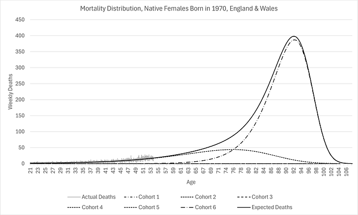
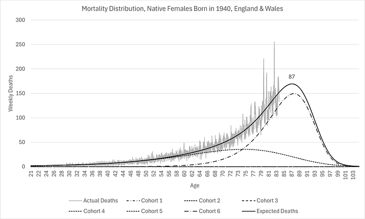
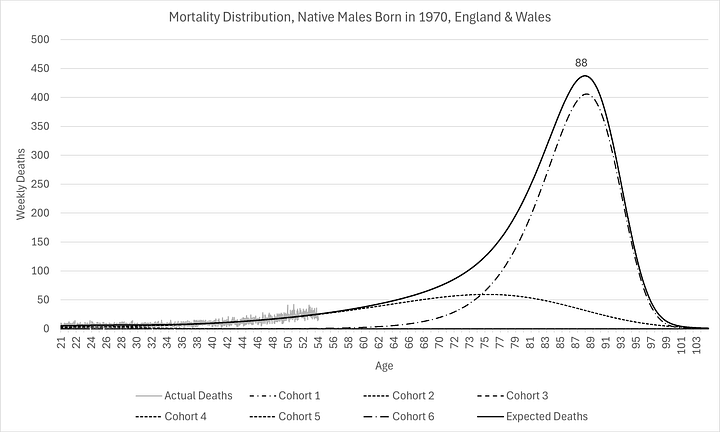
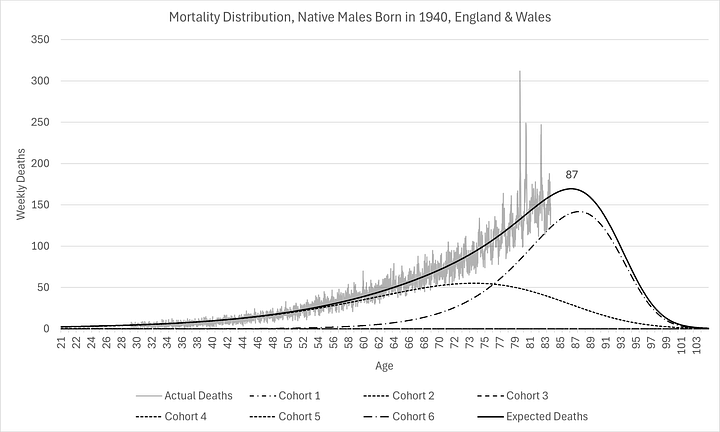
It is clear that, although the modes have not shifted too much (to the right), significantly more people are being kept alive longer, even if they are not living longer, resulting in much higher modal peaks and narrower distributions (smaller standard deviations). The distributions are so different, as L.P. Hartley2 once told us, they might as well be from different countries!
We can simply take the expected number of deaths in any week divided by the total number of deaths in the whole density to produce an expectation of death in that week:
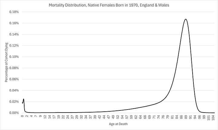
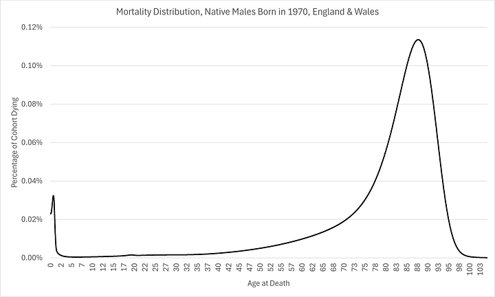
These probability distributions can be used to determine risk of death but also, perhaps knowledge of the characteristics of the different cohorts might make for even better underwriting decisions and lifestyle choices for the individual (principally, whether or not you find yourself in cohort 5 or 6 because I suspect there is much less you can do about being in the first 4 regimes).
For reference, here is how the models fitted to the logarithmic empirical model:
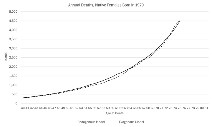
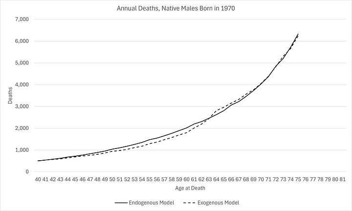
Note that outcomes for this cohort are worse than expected for ages 40 to 65, given the progress made between the 1920s and 1950s. This is not the first time I have observed this in the data.
And, here is an example of one slice of the logarithmic empirical model (those aged 60 at death through time):
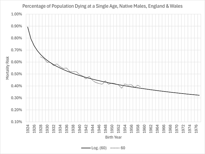
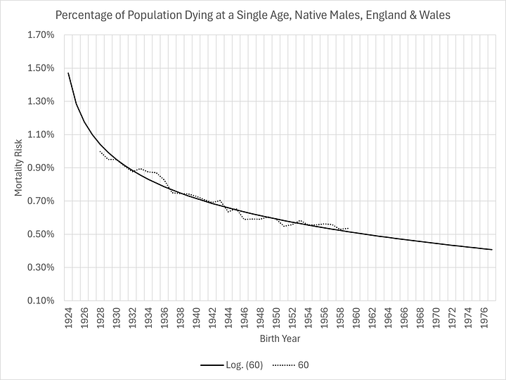
Very difficult to argue against that modelling!
There are some other benefits to using this approach to modelling. There is accurate estimation of excess mortality, the original motivation for my work:
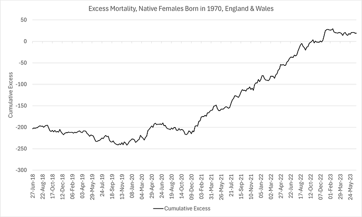
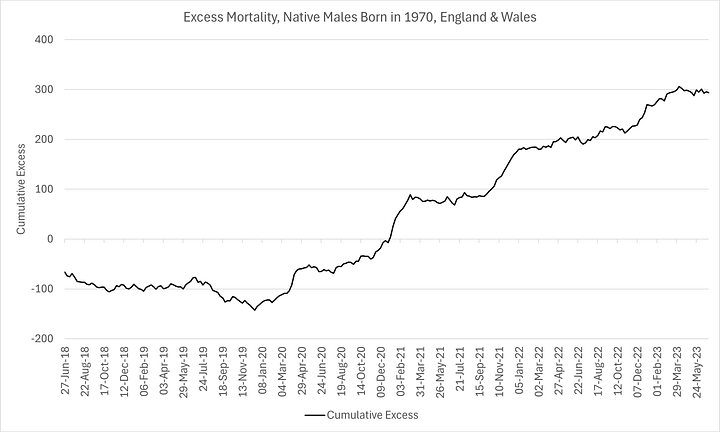
Note how stable the model is between 2018 and 2019, albeit showing a very modest deficit on a cumulative basis (so-called “dry tinder”). More noteworthy is how sustained the excess mortality has been since the pandemic response, further confirmation of the theory that the excess deaths were largely iatrogenic in nature (treatment protocols and pernicious “vaccines”).
But also (and again thanks to Dr Clare Craig for this insight), it was possible to produce more accurate population estimates as a function of empirical deaths in a given year and the probability of death and sum of the residual probabilities at that time.
For this cohort, in 2019, I estimate a male population (aged 49) of 462k and a female population of 443k, of which 88k (19%) and 78k (18%), respectively are immigrants.3
In other news, I have recently joined the Institute and Faculty of Actuaries (I know, right?!). I have applied for access to the Continuous Mortality Investigation mortality tables to see how my results compare with theirs.
Given that the entire insurance industry relies on their life tables (and I believe they are driven primarily by the “empirical distribution”, rather than a well-modelled, prospective one), this could have rather a profound impact on risk premiums if our results are substantially different.
Addendum
For those who are unfamiliar with my prior work on the subject, I include the distributions for the 1924 cohort. These serve to absolutely validate the Gompertz modelling. Two final regimes perfectly capture the entire dynamics of the bulk of the mortality:
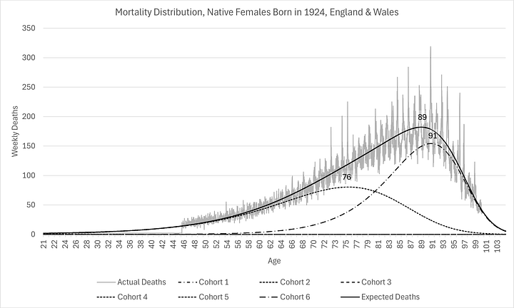
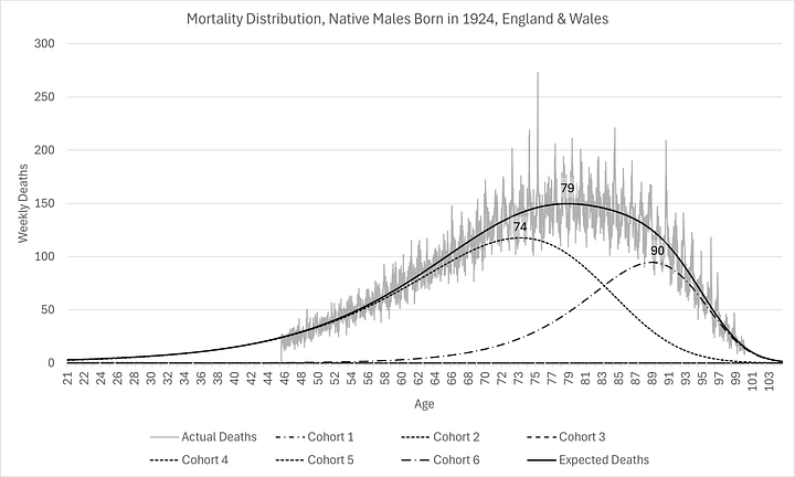
Note how far left and flat the mode is for the males, compared to 1940 (which in turn was much closer to 1970). This demonstrates again that most of the improvement in mortality outcomes occurred in the first half of the 20th century. Or, was it entirely due to WWII in some way? But also, pay particular attention to the two individual regimes. Their shapes are remarkably similar to the last two regimes of 1940 and 1970. All that has happened is displacement from regime 5 to regime 6.
For the females, there is little change, apart from the compression. This highlights what I said in the fourth paragraph. Male longevity has really caught up with female. This is due to relatively more males migrating from regime 5 to the healthier regime 6. It would be really interesting to know the major factors that contributed to this, wouldn’t it?4
Kannisto V. Mode and dispersion of the length of life. Population: An English Selection. 2001;13(1):159–171. [Google Scholar]
“The Go-Between”
Assuming immigrants follow the same process as natives.


Oh my, you'll have your hands in the proverbial cookie jar with access to those actuarial tables!!!😉👏👏💯
Keep us posted, and do us a favour, give us a heads up, first, if you think our premiums are in danger of skyrocketing🤔🤨😉 Before you pass the data on🙏😉
I love your articles!
As a failed O level maths student with definitely no aptitude for any sort of maths or graphs, I quite often impress myself by understanding what you are saying.
Today, I'm sorry to say I have absolutely no idea what any of this is! Still, I read to the end and nodded. Keep up the good work!