A History of Life Expectancy, 1974 to Present, England & Wales
Confirmation that COVID was nothing more than an ordinary, seasonal pathogen and the virus of government was the real epidemic.
Conclusion
Using accurate, granular data and an exact, empirically-validated model, it is clear that the extraordinary mortality events of 2020 to 2024 in England & Wales are associated with public health intervention and not with the emergence of a novel respiratory pathogen.
Setting the Scene
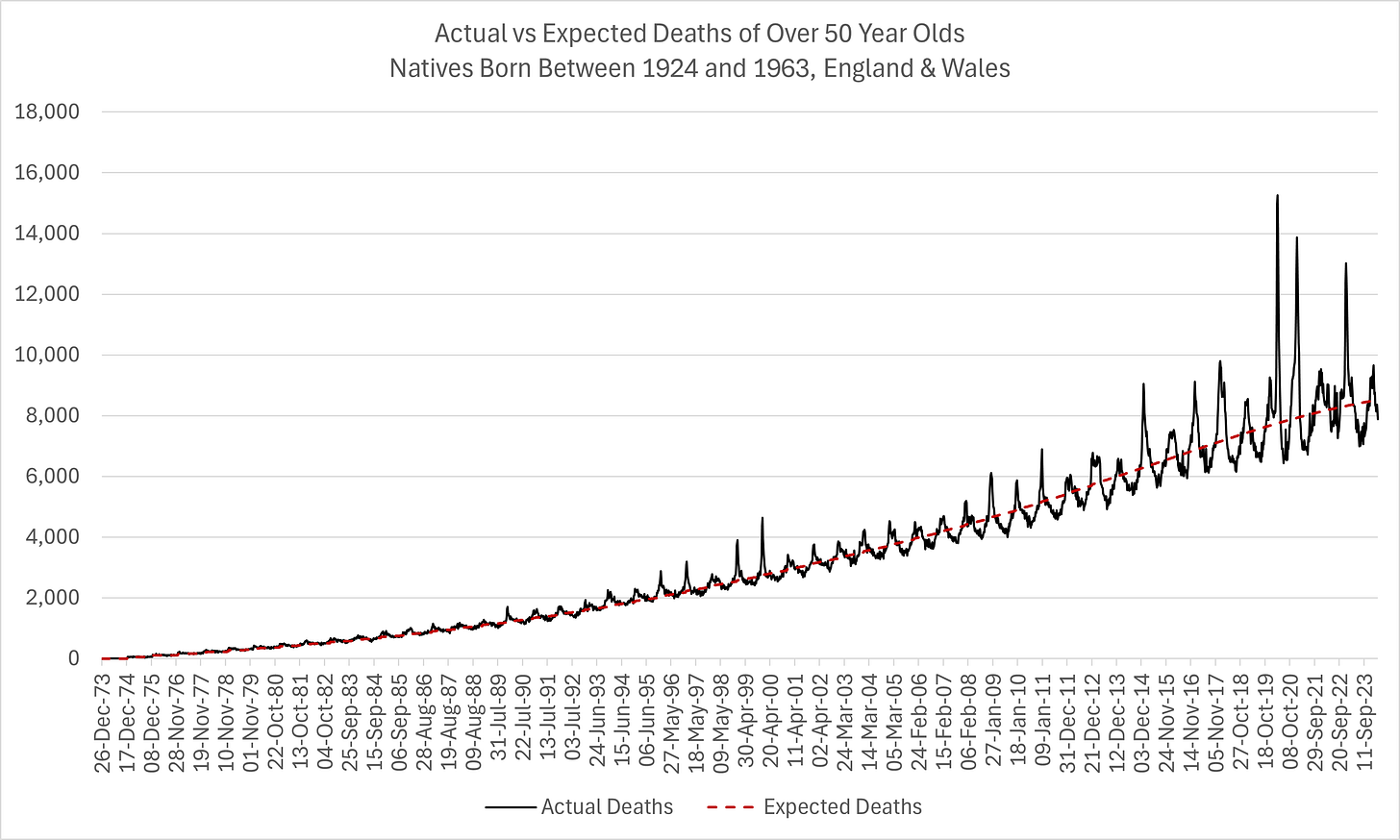
Since 1974, this is the picture of raw mortality for natives aged over 50 at the time of death.
The series increases over time simply due to the fact that more and more birth cohorts are added. This is the result of what data was available. In other words, since the data is only available from birth cohort 1924, in 1974, there is only one cohort that is at least 50 years old. In 1975, there are two, with the addition of those born in 1925, and so on…
Broken down by sex, this is the excess mortality for native males since 2008:


And for native females:


This is useful context within which to interpret the excess mortality patterns of the contemporary period. Reasoning with evidence rather than dogma might have encouraged politicians like Johnson and Hancock to use more tempered language in spring 2020 instead of creating an adverse environment for economic and social detriment1.
The Pandemic Years
Next, we are going to zoom into the “pandemic years”, 2019 to 2024, and also break it down further by range of birth cohorts. Let’s start with native males born between 1924 and 1933:


As we have witnessed in many other analyses, the excess mortality does not start until week of 25th March 2020 when social and health infrastructure was severely disrupted and regular treatment protocols adversely affected. Otherwise, the COVID pandemic is not noteworthy.
Once again, in the regular mortality season 2020/21, there is nothing unusual until the week of the mRNA experiment, principally the first week of Jan 2021 when the most vulnerable were attacked.


Inevitably, it is a similar picture for the native females. However, the start of the adverse mortality that coincides with COVID policy, as opposed to the emergence of the “novel” virus, is even more apparent - marked red on the chart. There is literally no excess mortality the week before government policy changes.
Also, note the pull-forward effect, manifesting in the later years. Of course, this is exactly what we would expect, especially in this oldest cohort who were already the nearest to death.
Let’s zoom in further and mark the first inflection point more clearly:
Literally nothing brewing until lockdown week then, all of a sudden - bang! Curious…
For completeness, I’m including birth cohorts 1934 to 1953 even though they don’t reveal any new insights over the forementioned:


More interesting is the youngest cohort in this analysis - those born between 1954 and 1963:


In these cohorts, there is substantially more excess mortality since the start of 2021, not 2020 when the “novel” virus allegedly first emerged.
And, let’s take a closer look again at the start of the “pandemic” for these young ladies:
No, your eyes do not deceive you, there is a discernible dip in the week ending 18th March 2020, just prior to the iatrogenesis pandemic that it really was.
I have never doubted the existence of COVID, nor its potential impact on mortality. Looking at this chart reassures me. In my opinion, COVID is represented by the excess mortality distribution between 5th Feb 2020 and 18th March 2020. In other words, it was a very ordinary, late season pathogen, associated with (though not definitively causing) a relatively benign mortality outcome relative to prior seasons.
It is only with the massive, inappropriate government intervention, starting third week of March 2020, that an extraordinary mortality event occurs, lasting until the end of May when the intervention stops.
But, even this is eclipsed by the mortality that coincides with the imposition of the mRNA experiment in mid-Dec 2020, which itself is eclipsed again in Nov 2022 when this “novel” pathogen really should have been history, regardless of its entirely normal pathogenicity in the first place!
What could possibly be responsible for that sudden spike in mortality in these sexagenarians?
I have exposed the real causes of excess deaths before. In spite of a completely novel approach, this analysis supports all of my prior insights and conclusions:
How to create a deadly pandemic in five easy steps
PROBLEM - REACTION - SOLUTION 1. “Accidentally” release an ordinary virus (because your GoF abilities suck), that can only be detected using a special test, cranked up to the max - blame it on the Chinese and then deny it. 2. Euthanise old folk and blame it on the virus when, in fact, it was pneumonia what done it!
The Model
Expected mortality is a strict function of births and probability of death.
In this regard, having excluded all immigrant deaths, we are left with a reliable dataset2 to work with, notwithstanding the fact that we have not allowed for emigrants dying overseas and not reporting the event. Nevertheless, I do not see evidence of this affecting the model like I have previously with the immigrant bias, probably due to the significant net immigration to the UK.
Every model should be validated3. Fortunately, with a near complete empirical set for the 1924 birth cohort, this is possible:


As we can clearly see in the figures above, two 3-parameter models are adequate to characterise the entire mortality distribution of a single birth cohort for those dying aged 50+. According to my experience, more regimes would result in a better fit. For example, there is a distribution that starts in the mid to late teens, whose tail runs into the 50s.
Each model is a Gompertz with a point cumulative, an instantaneous growth and constant decay. The models were fitted numerically, jointly calibrating both cohorts simultaneously.
Each subsequent birth cohort’s model was seeded with the parameters of the preceding birth cohort and limited to three iterations4. This ensured parametric consistency and helped to inform or shape later cohorts, especially as less and less empirical information was available for calibration5.
The model was further validated with respect to births. Even though births were not a model input, we should still expect to see a relationship between the magnitude of the mortality distribution and the the number of births. Indeed, reassuringly, we do:


The correlation between births and deaths is obvious. The difference is entirely explained by those that die before 50 (see below) and the different death probabilities, i.e. the mortality distribution itself.
In other words, the a priori assumption holds - expected death is a strict function of birth and probability of death. This tautology is the premise of the model. Current population estimates are not necessary to derive mortality rates. All you need are births and a good probability density function. With a model that is as robust as this one, you don’t even need birth numbers, just a handful of empirical data points for calibration.
In fact, the above charts very ably demonstrate the pitfall of using age at death and population estimates. Imagine where such models would set the expectation of mortality for 80 year-olds in 2025? As a function of 2021 through 2024, the estimate would be higher than 2024, whereas it should be much lower due to the dramatic drop in births in 1945.
The combination of the two distributions results in a single mortality distribution from which:
An accurate life expectancy could be derived for the entire birth cohort;
An aggregate mortality expectation could be produced by summing all the distributions.
The life expectancy of each distribution (cohort) was calculated as the arithmetic mean. We should emphasise here that this is the life expectancy for those who have already survived to 50 years old. We might also, therefore, consider the proportion of the birth cohort that survives to 50 if we wanted to properly assess improvements in mortality outcomes:


The absolute distributions reveal the idiosyncratic nature of each distribution, underlying the point that cross-sectional analysis of mortality by age (even single year of age over time) is inappropriate:


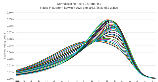
The normalised distributions are an appealing depiction of improved mortality outcomes through time:


Although not labelled, the distributions morph from top, back left to the front, with pretty much each new birth cohort. What we see is more and more people moving from death in their 60s and 70s to their 80s and early 90s. there is, alas, little evidence to suggest life is prolonged for the already very healthy of society.
The normalisation was done by simply scaling each distribution point over its sum. Note the distinctly different distributions for males and females.
The conclusion of this model is once again the importance of using granular, occurrence-date data, stratified by sex and year of birth (not age at death) in order to derive a reliable mortality baseline from which to estimate excess death.
Further Work
Everyone is welcome to use this data6 for their own research. I believe it should be very useful for those working in actuarial sciences, medical research, public health and the insurance industry.
Next up, I will be preparing the same data for the under 50s and doing some deeper analysis on the summary results.
COVID-19: the virus is the government
In spring 2020, the UK government followed the instructions of an unelected, global organisation to impose draconian restrictions and inappropriate treatments in response to an otherwise ordinary, respiratory pathogen. As a result, 47,500 people died sooner than expected.
COVID-19 - Where was the Public Health Emergency?
Today I’m going to be answering the question “COVID-19 – where was the Public Health Emergency?” In other words, “How serious was the threat to public health and was the government response proportionate?” Given the media attention given to COVID and the extraordinary global response, you might think this is rather an odd question to ask at all.
COVID-19 - Was the “cure” worse than the disease?
Welcome to the 2nd episode of the Red Pill Report from Dead Man Talking. In the last episode, I presented the case that the UK government response to COVID as a public health threat was disproportionate. The mortality data did not support the premise that COVID was the “biggest threat faced by the UK in decades” and certainly did not merit the “most significant set of restrictions on British life in living memory”.
Explained here:
🚨BREAKING🚨 UK Immigrants Dying at Substantially Higher Rates than Natives Since Spring 2020
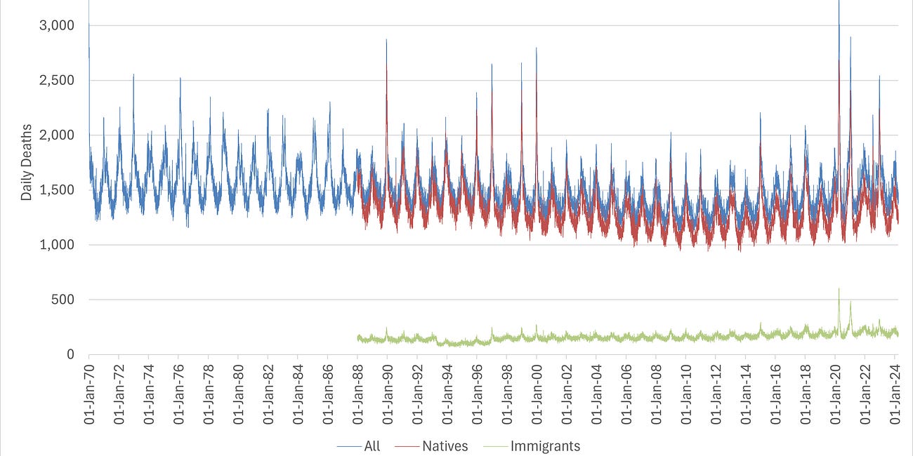
After fifteen months, I finally got the best mortality dataset available in England & Wales - daily deaths by date of occurrence since 1970, stratified by year of birth and sex. As advised by Dr Clare Craig, due to the possible confounding of immigration, they provided two datasets so we could derive a consistent dataset for analysis that was free from bias:
Take note Imperial College, Office for National Statistics, UKHSA, etc., etc…
With unlimited iterations, more optimal, numerical solutions were found but to the detriment of parametric consistency, even discovering new local minima and completely different relationships between the two distributions.
It should also be noted that data post Feb 2020 was not included in the model calibrations to account for the anomalous, excess death resulting from the “pandemic” response that do not yet appear to have filtered through into the pull-forward effect as yet. To leave these data points in the calibration would result in an erroneous baseline or expectation, the sort of naïve modelling you would only expect from the ONS and other state-sponsored statistical agencies.
N.B. it’s a very large file and if you want to recalibrate it, I run it on a system with 36 CPU cores and 128GB of RAM.


Life expectancy jiggles back and forth depending on the how the youngest among us survive, not how much longer the oldsters are living. The calculations have slid downward because more young people are dying. All that really matters is your life expectancy, not where you fit in with the masses.
Brilliant analysis. I see from a previous comment you have an actuary background and it shows.
I think this resolves two apparently irreconcilable facts:
In March of 2020 Dr. Ioannides used hard data from the Diamond Princess to estimate the CFR of covid to be about the same as seasonal flu and so would cause about 10,000 deaths in the US, highly stratified by age and health status.
But, there have been massive excess deaths starting in 2020 in almost all Western countries, and is still continuing.
So why are there so many excess deaths if the virus isn’t especially deadly? Ioannides is one of the most highly cited scientists working; he didn’t make a mistake, and the virus was constantly mutating to become less fatal and more infectious.
But as you’ve shown, the answer is hiding in plain sight: they were killed by what the governments did to “protect” us. They died of other causes but had a meaningless positive test within 28 days and so were classified as a covid death. And those other causes were worsened by the terror of 24x7x365 news of body counts and cases and new variants.
I suspect the working actuaries know the perfectly well and don’t have to jump through hoops to get the data, but they are talking publicly. They just have to set the premiums for new policies and have enough to do without wading into such a hot topic.