Death ⚰
Everything you need to know. Well, almost. Soon. 🙏
The good news is that the ONS has finally quoted me for the “super” dataset1.
The bad news is that it’s not super. They only have digital records of all deaths since 1970, so all we can get is an extension of the dataset we already have but with some better stratification (by month/year of birth, excluding foreign births).
The worse news is that it may take 14 to 16 weeks to produce due to massive staff shortages.
Nevertheless, in the meantime, I managed to dig out some mortality data from the National Archives that provides yearly deaths in England & Wales since 1901, albeit stratified in 5-year age buckets. It’s also by registration date but I guess you have to work with what you’ve got?!
Specifically, I was able to splice this dataset with the later one and establish full series mortality distributions for several years, providing insights on the distinct phases and a method for estimating the total expected number of deaths for each cohort at any particular age. This helps to properly calibrate the Gompertz model - in simple terms, the number of people born minus those that have already died!2
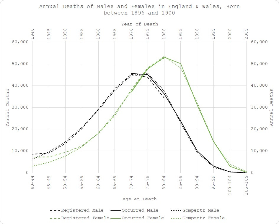
If we start with men and women born between 1896 and 1900, the remarkable thing is that it is not remarkable:
Fitting my Gompertz function to this data was straightforward3. I included all the data from age 40 (before which the mortality follows a different distribution). As you can see, there was virtually no change in expected mortality outcome for men since the age of 45 and for women since the age of 554 - dotted lines on the chart.
In fact, my model fits the occurrence data (solid lines) better than the registration-date data does (dashed lines)! A timely reminder of how faulty that latter metric is.
It is worth pointing out the substantial differences between mortality outcomes for men and women. Over time, this difference attenuates but it’s always material. You will also notice different scales, even with data averaged over 5 years due to substantial variation in births year-on-year. Aggregating sex, bucketing ages and trying to compare age cohorts over different time periods (instead of a single birth cohort) is really going to mess your analysis up.
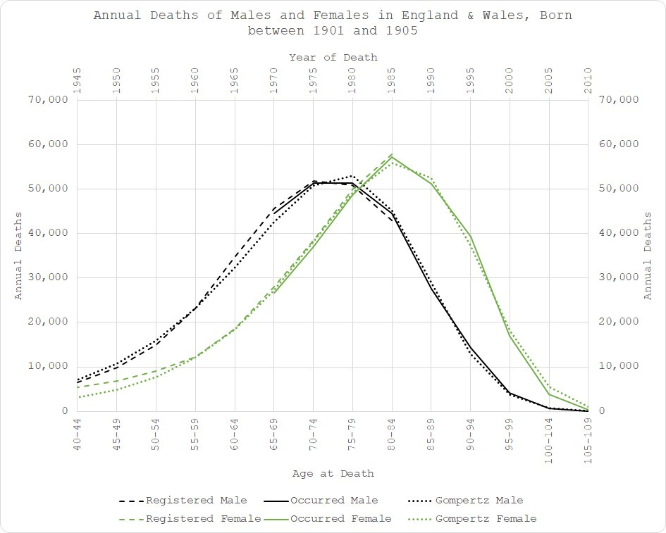
Moving forward to 1901-1905 birth cohort and things start to get a little out of line:
There is quite a clear excess in male mortality starting in the mid-60s (age 60+) until the age of 75 - indicated by the fact that the empirical dashed and solid black lines run above the dotted line (the modelled expectation), i.e. more people died than expected = excess. I don’t want to speculate much here because that will be the subject of the final analysis but it does coincide with the widespread use of statins. Just saying.
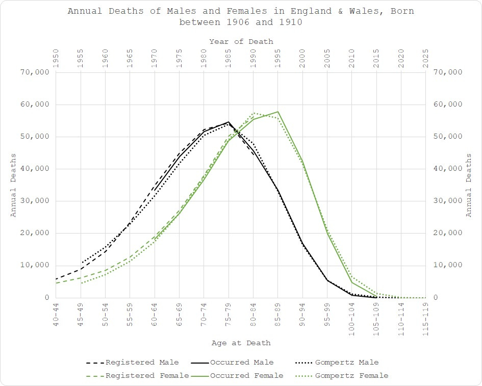
The same pattern is apparent in the 1906-1910 cohort:
Since 1910,things get rather more difficult to model. Not only is the data now becoming incomplete but there are some rather obvious anomalies creeping in.
Starting in the early 90s, women aged 80+ are now dying much more frequently than expected:
Again, not wanting to speculate much but this is around the time they changed the end-of-life protocols, I believe - the “Liverpool Care Pathway”.
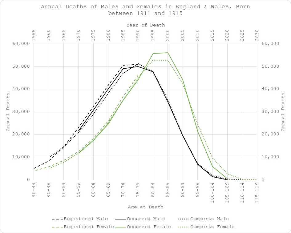
For the 1911-1915 cohort, we can see higher female deaths between 1995 and 2005 (empirical solid green line is higher than the modelled dotted line), followed by the “pull-forward effect” (solid green line below dotted line after 2005), in addition to the higher than expected male deaths between 1965 and 1990 for those aged between 50 and 80.
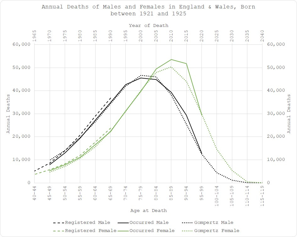
I’ll skip now to 1921-1925 for expediency. The male “statin” effect is now embedded in the distribution so the model fits to it. It’s like “Turtles All the Way Down”. After a while, the majority of people simply accept what’s only in front of them at the time, without looking back to see how they got there.
However, the female situation is getting worse:
It is notable that for this cohort, strictly speaking, 2020 (the year of “COVID”) is actually bang on expectation for the women. However, that belies the fact that such excess in 2005 to 2015 should be manifesting in a deficit at some point so this is still higher than “expected” expected!
As I have alluded to in previous posts, when analysed properly, it seems to me that the mortality trigger has been apparent since around the year 2000. Again, not wishing to speculate much but that’s about the time they ramped up the flu vaccination programme? Just saying.
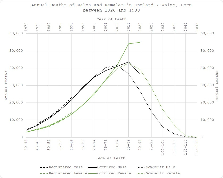
1926-1930 is a doozy - no need for fancy modelling to see something ain’t right here since 2005 (aged 75):
Just look at 2015! Both men and women are seriously in excess.
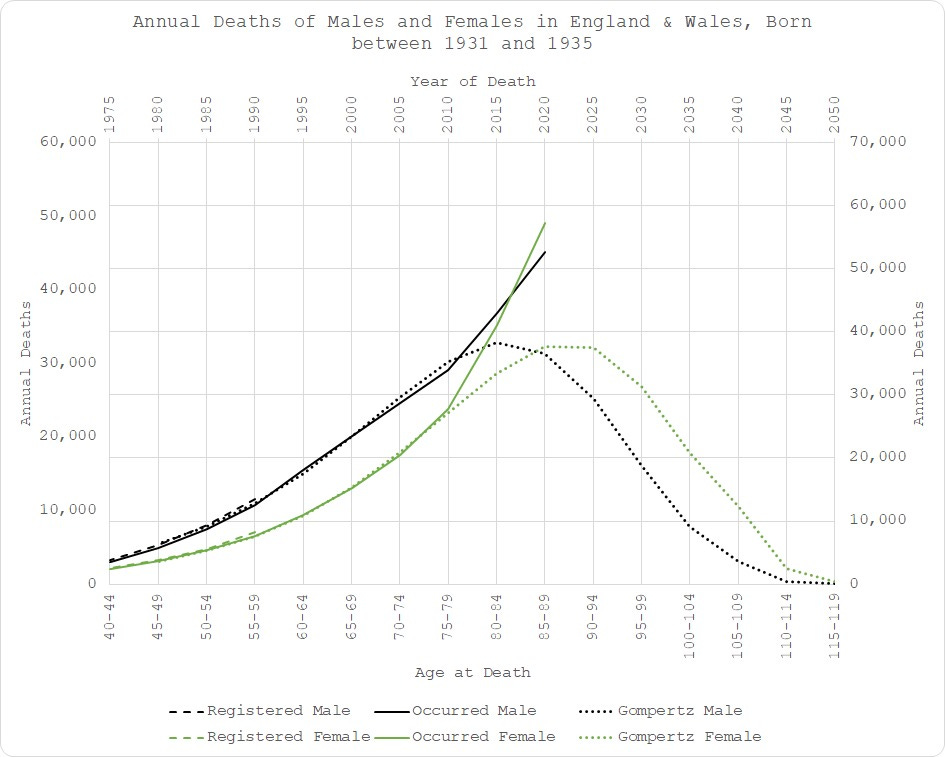
And 1931-1935…
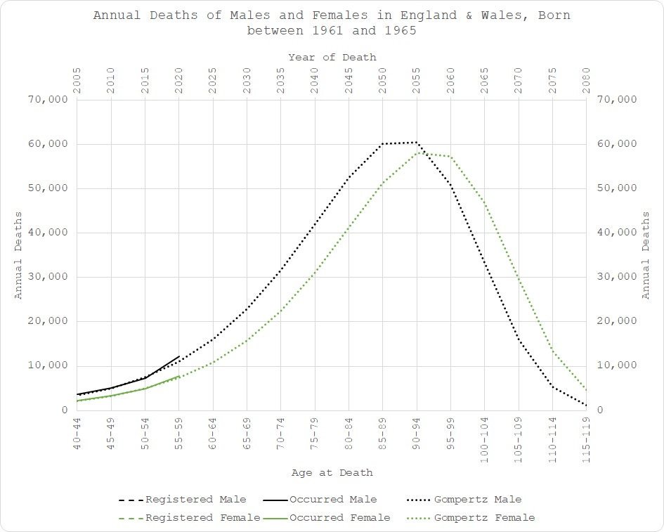
In fact, the pattern continues all the way down the ages until COVID is no longer much of an issue:
So, there we have it. Another little taster of what is to come once we have the extended monthly dataset. All is not what it seems - certainly not what the official “stats” tell you at any rate. Faulty metrics, inappropriately short baseline periods, inappropriate aggregation of sex and age groups, and inappropriate models in general all contribute to the obfuscation of the truth.
But, we will unearth it in the end! Thanks to the stellar observations of Mr Gompertz!
The extended monthly dataset will allow us to look in more granular detail where the excess mortality materialises and also take care of any confounding due to net immigration.
And it’s “only” £180 so I won’t need to crowdfund it!
If none of this makes sense to you, you probably need to review my previous pieces, explaining the model and its validity in detail -
Fitting is solving numerically for the three parameters of the Gompertz model: the number of deaths in the final age bucket; the instantaneous growth rate; and the rate of decay. The charts are histograms, depicting the number of deaths in a given year for a group of people all born in the same period.
I can offer no good reason for the regime change in the women except potentially some after effects of WWII.


Fascinating! Looks like 'progress' in medicine is once again bad for our health.
Safe anDeffective🍻👍